Introduction
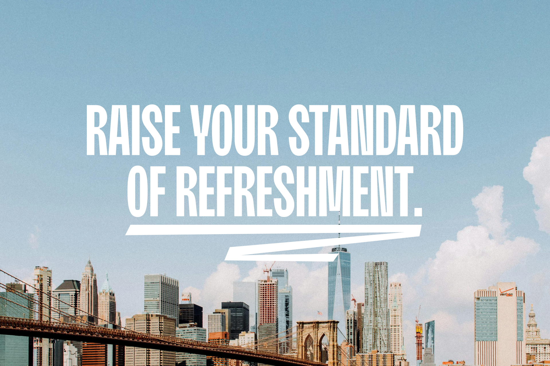
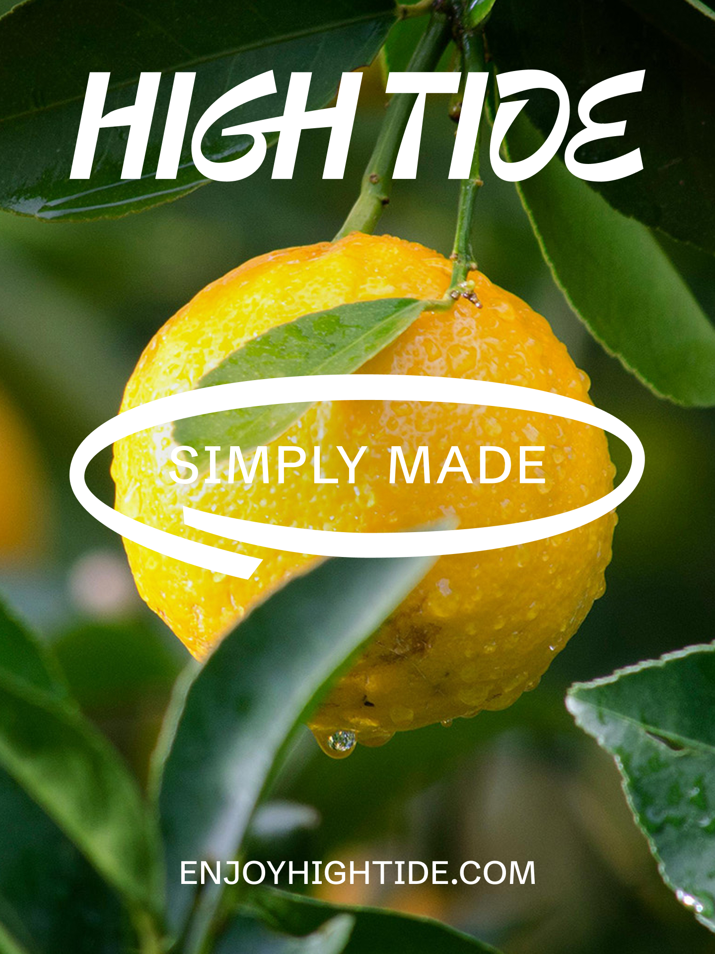
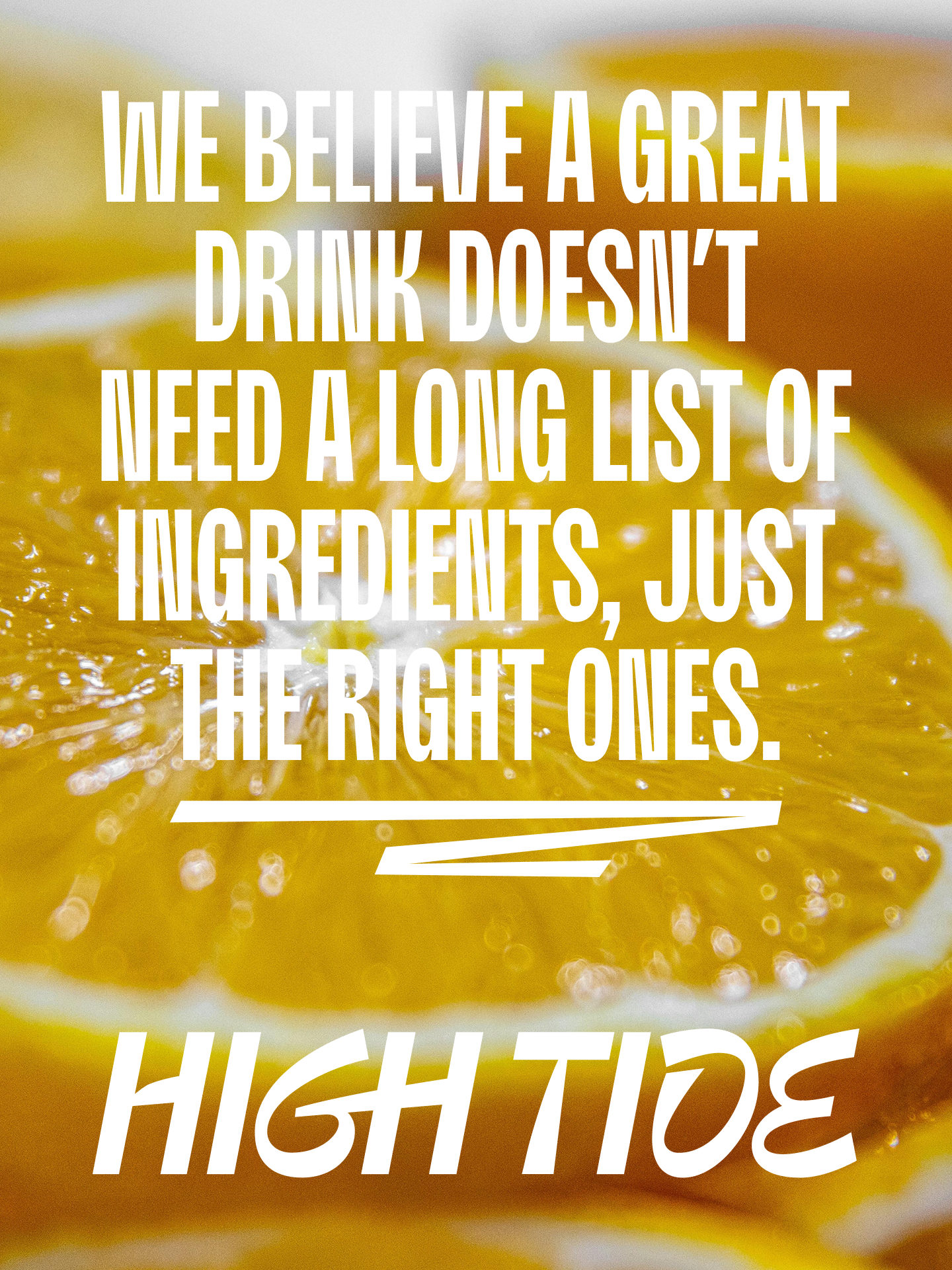
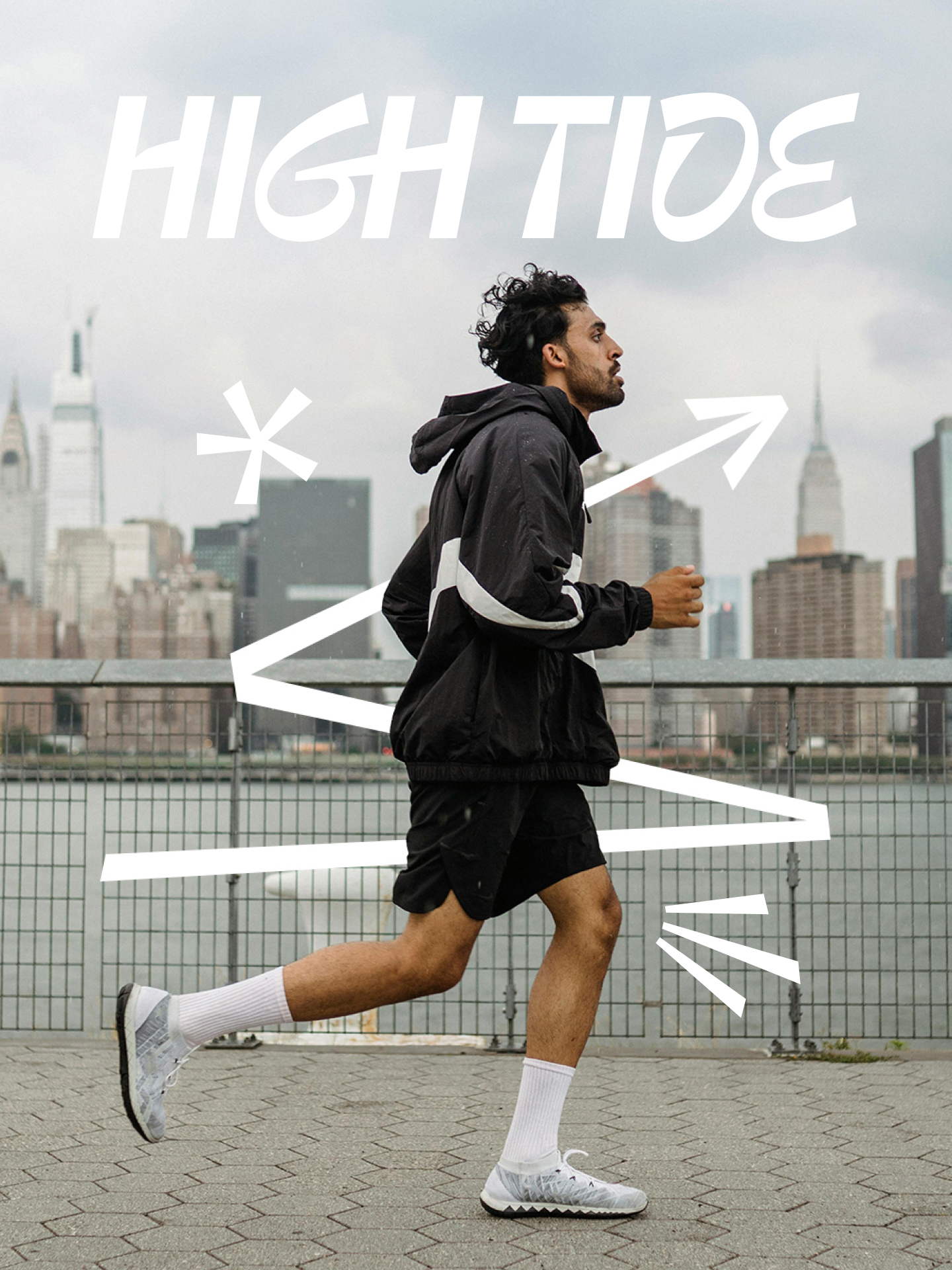
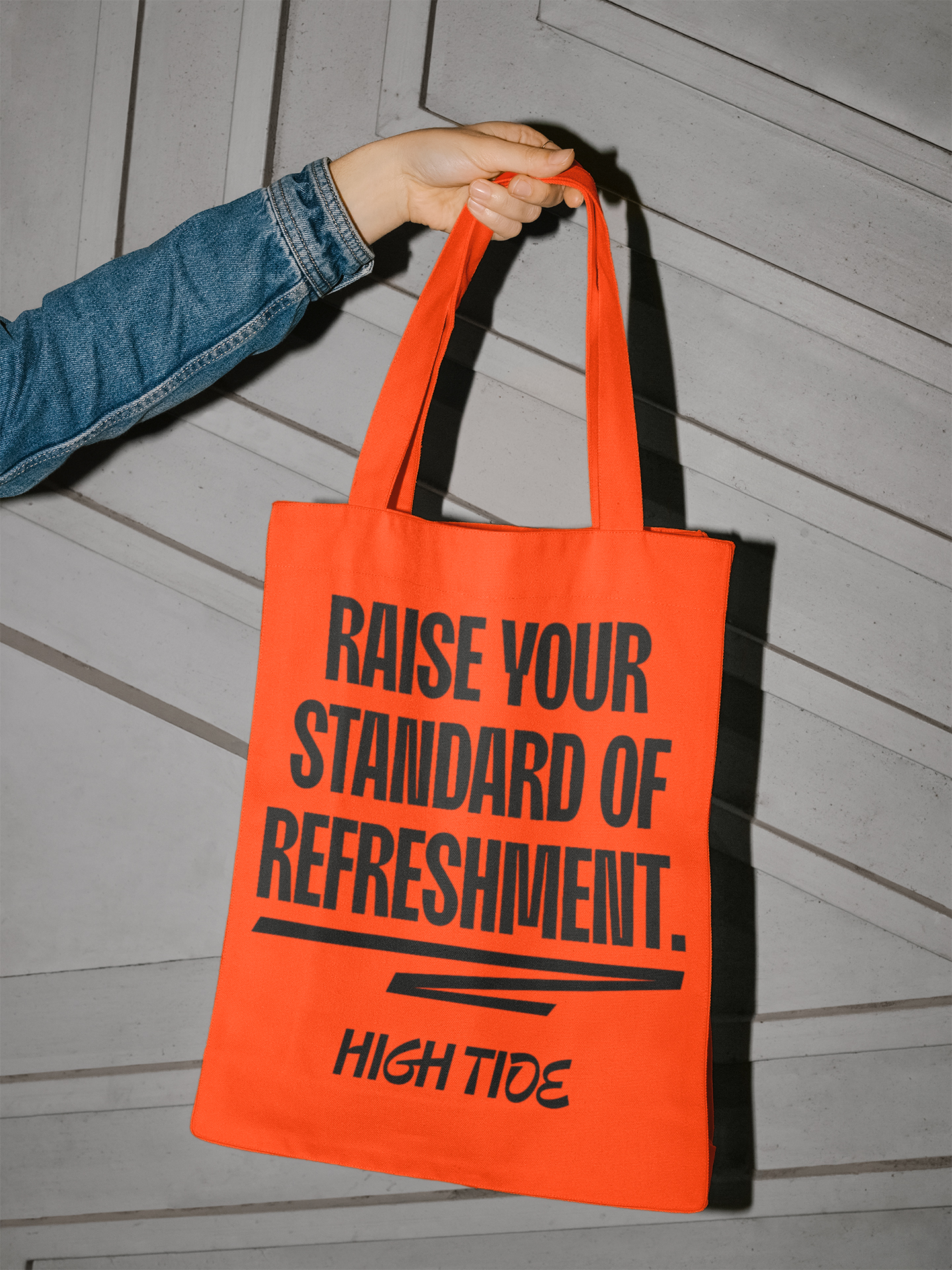
Raising the standard of refreshment.
Client: High Tide
Date: August 11, 2025
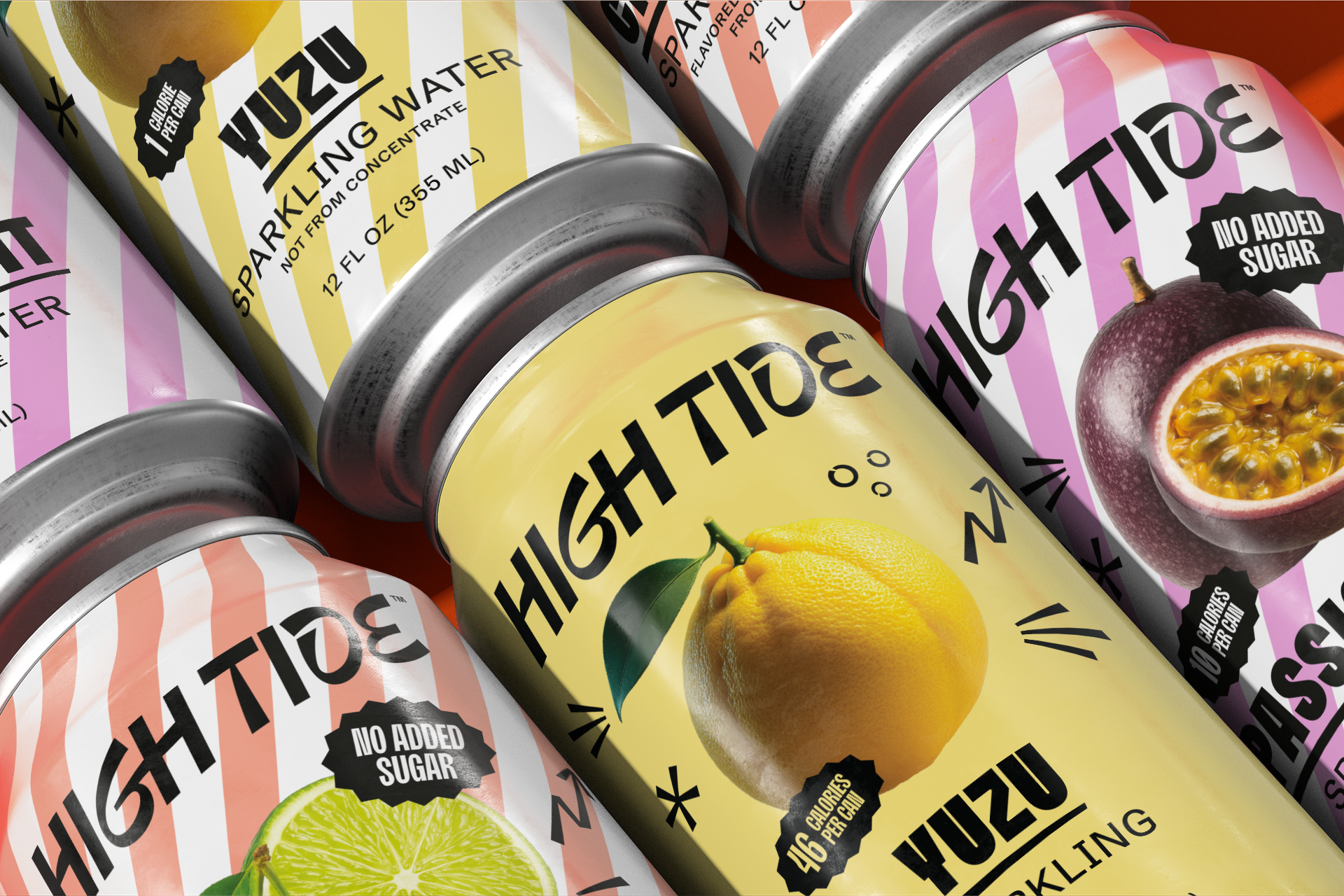
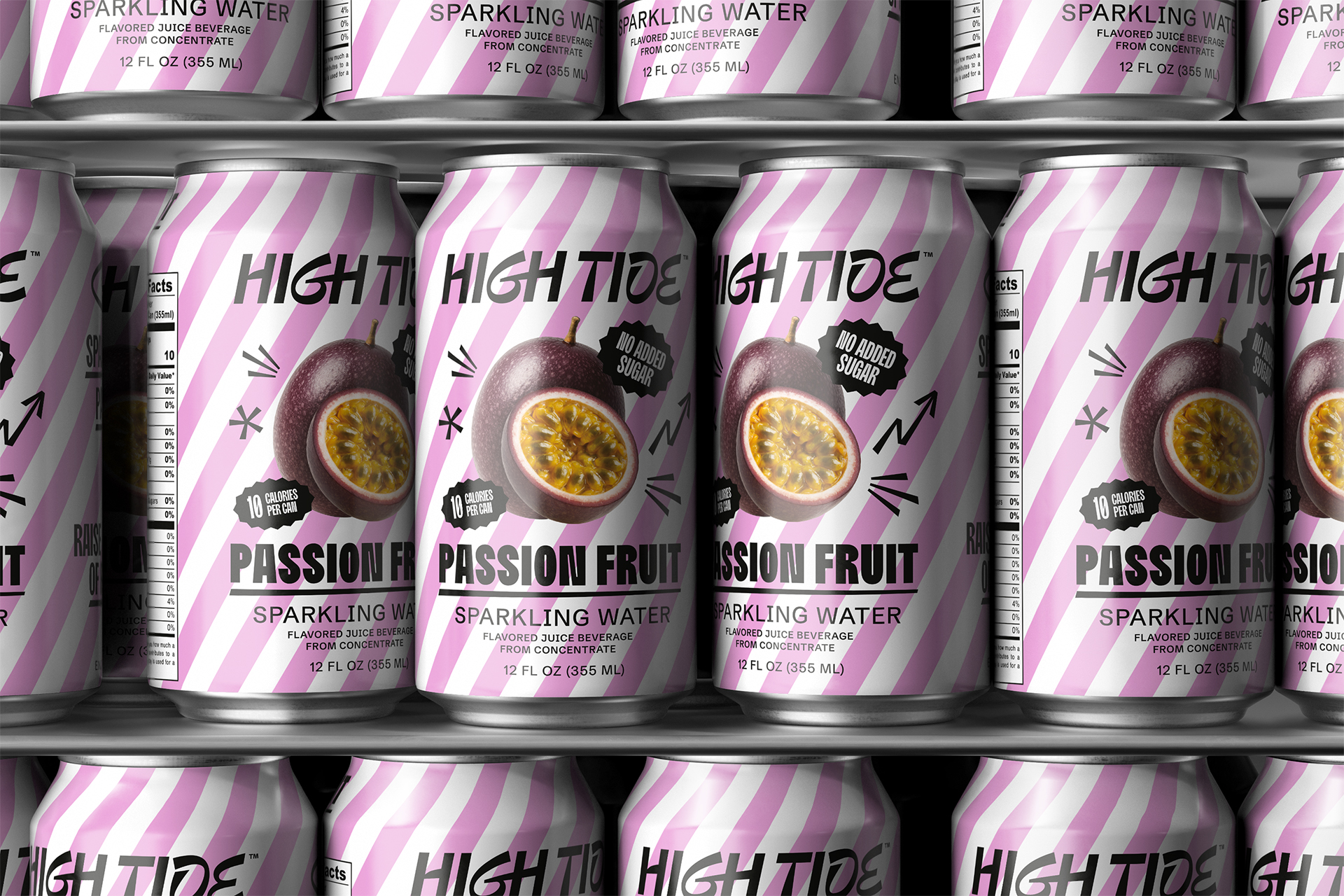
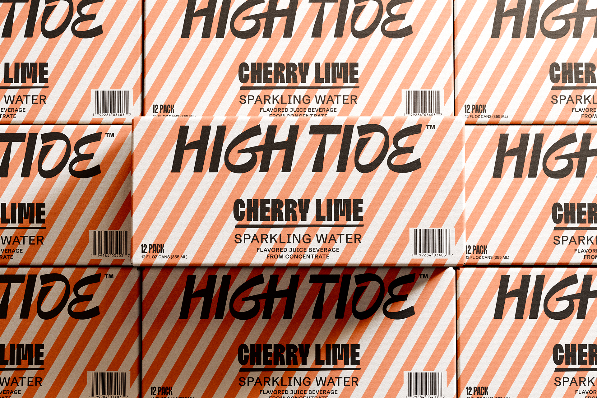
High Tide
Overview
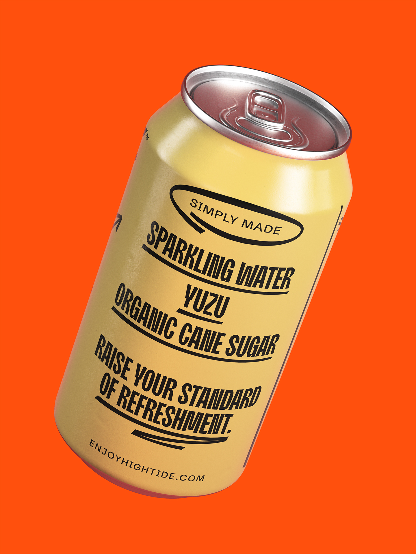
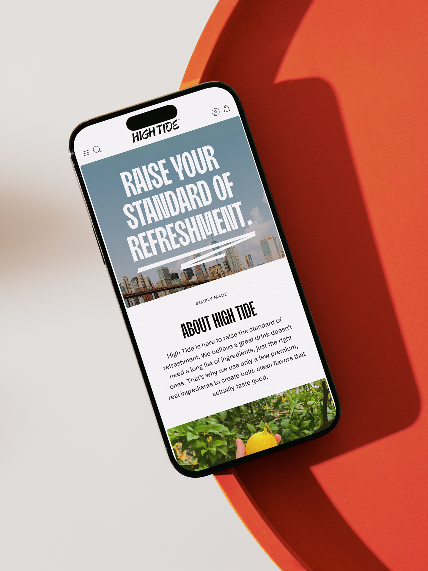
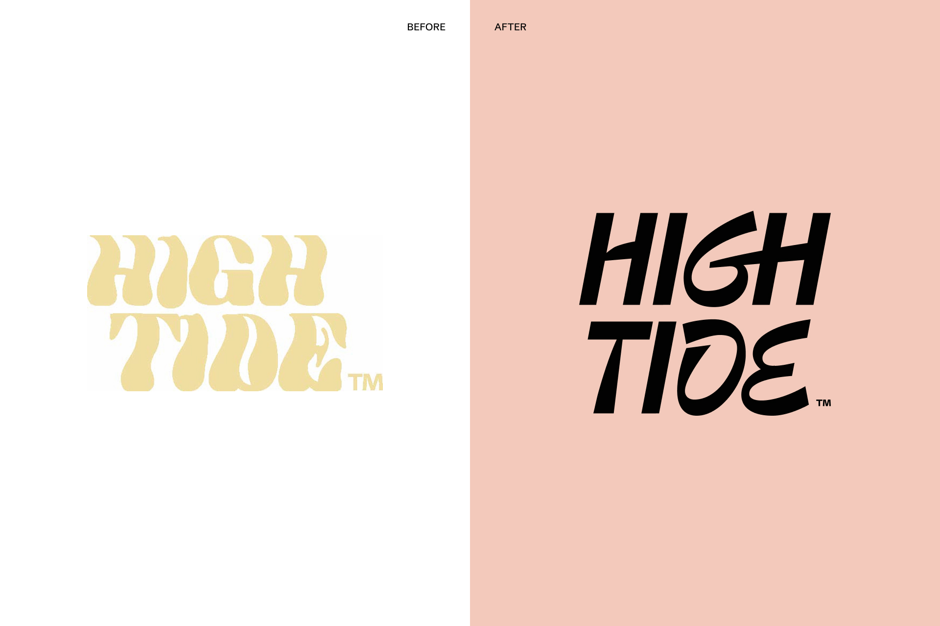
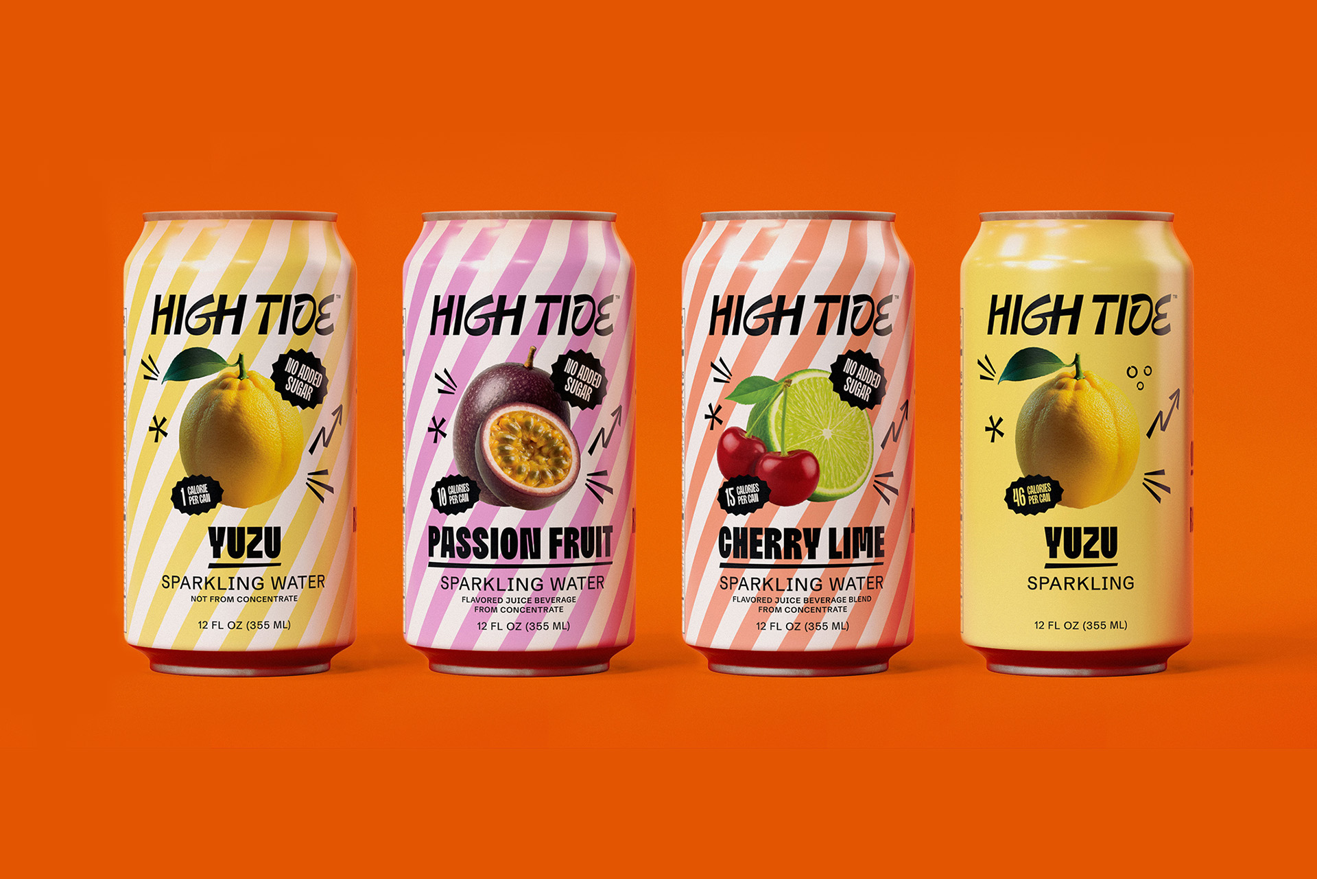
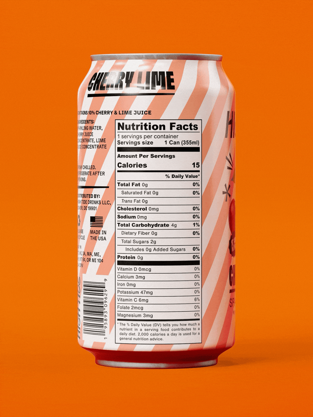
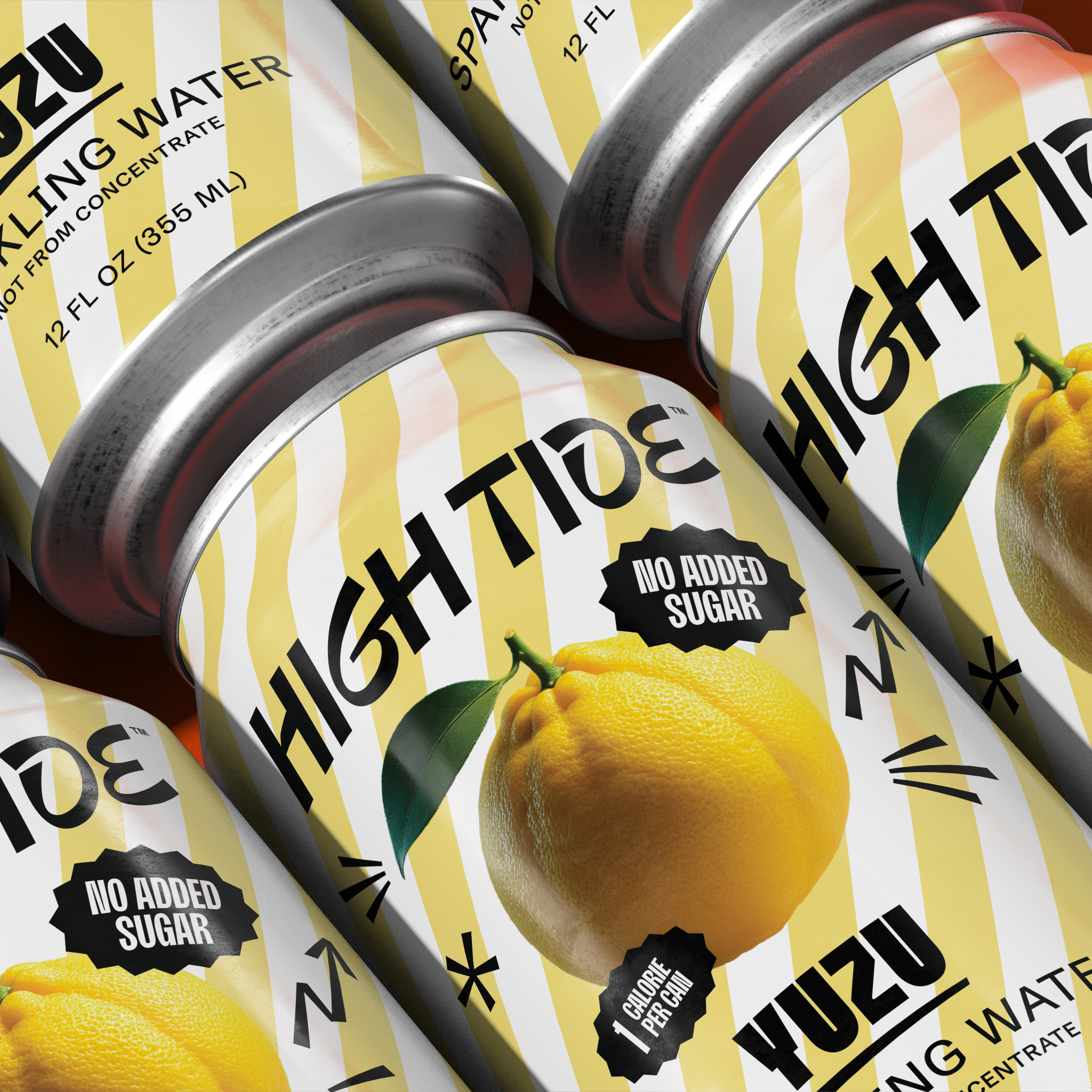
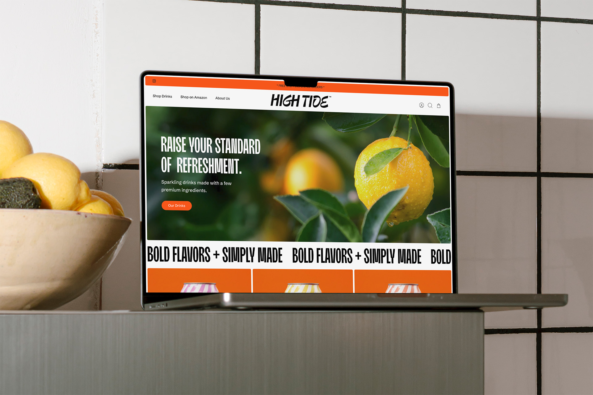
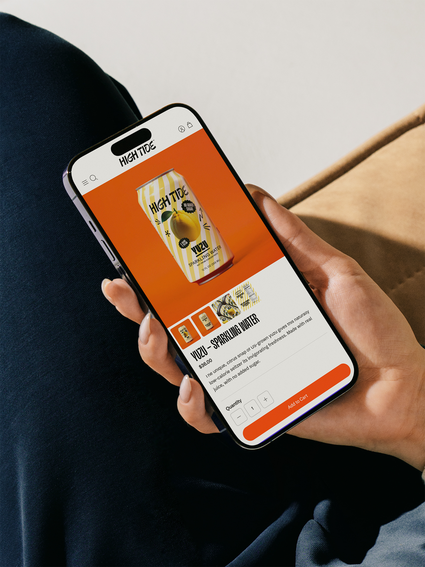
Brand Strategy, Brand Design, Can Design, Packaging Design, Art Direction
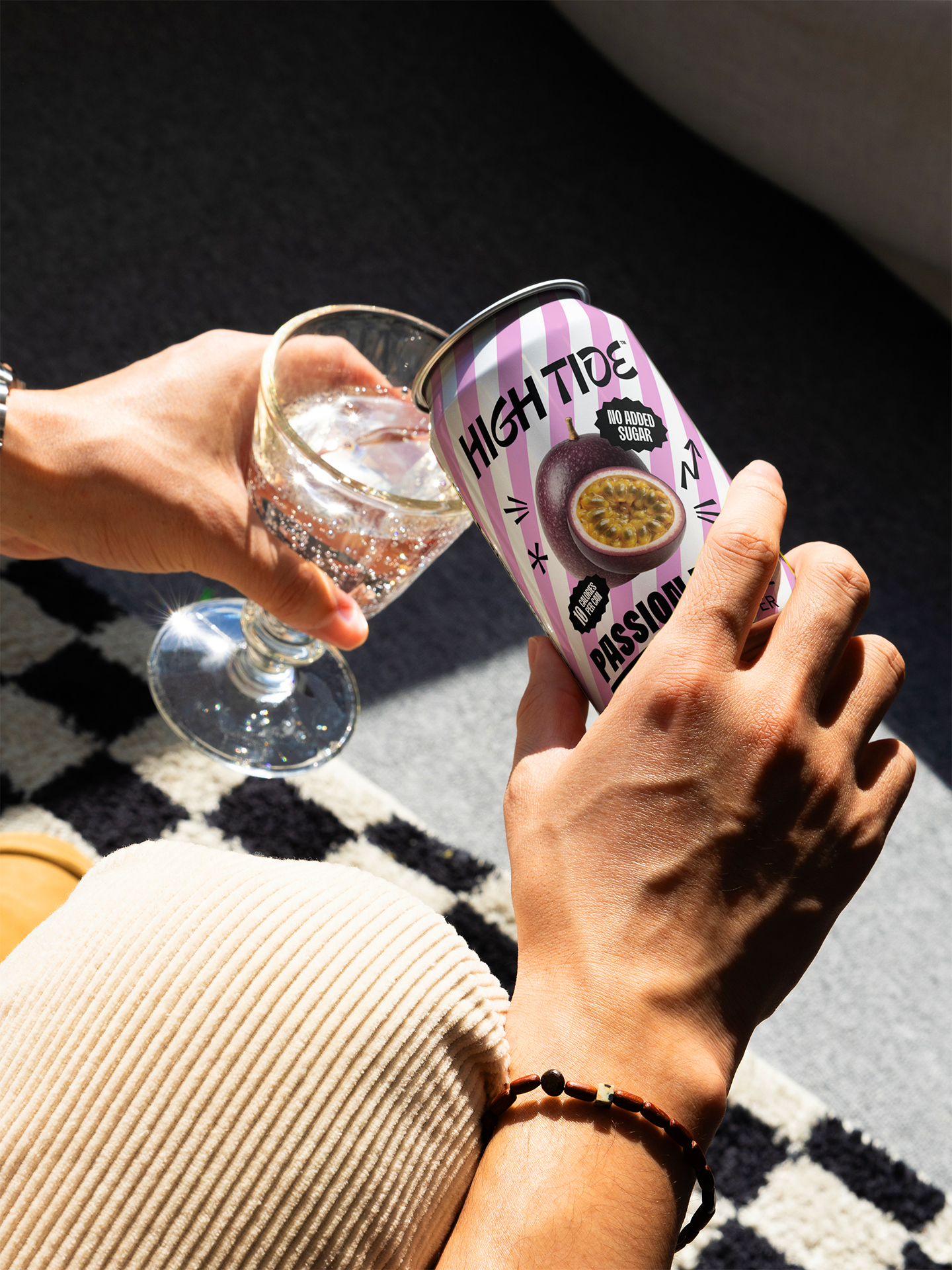
Toil partnered with High Tide to refresh their brand identity, packaging, and digital presence. The goal was to highlight what makes their drinks special and create a brand that stands out and feels aligned with their NYC roots.