Is there a better way to bathe your pet? We think so.
Buzz Bar
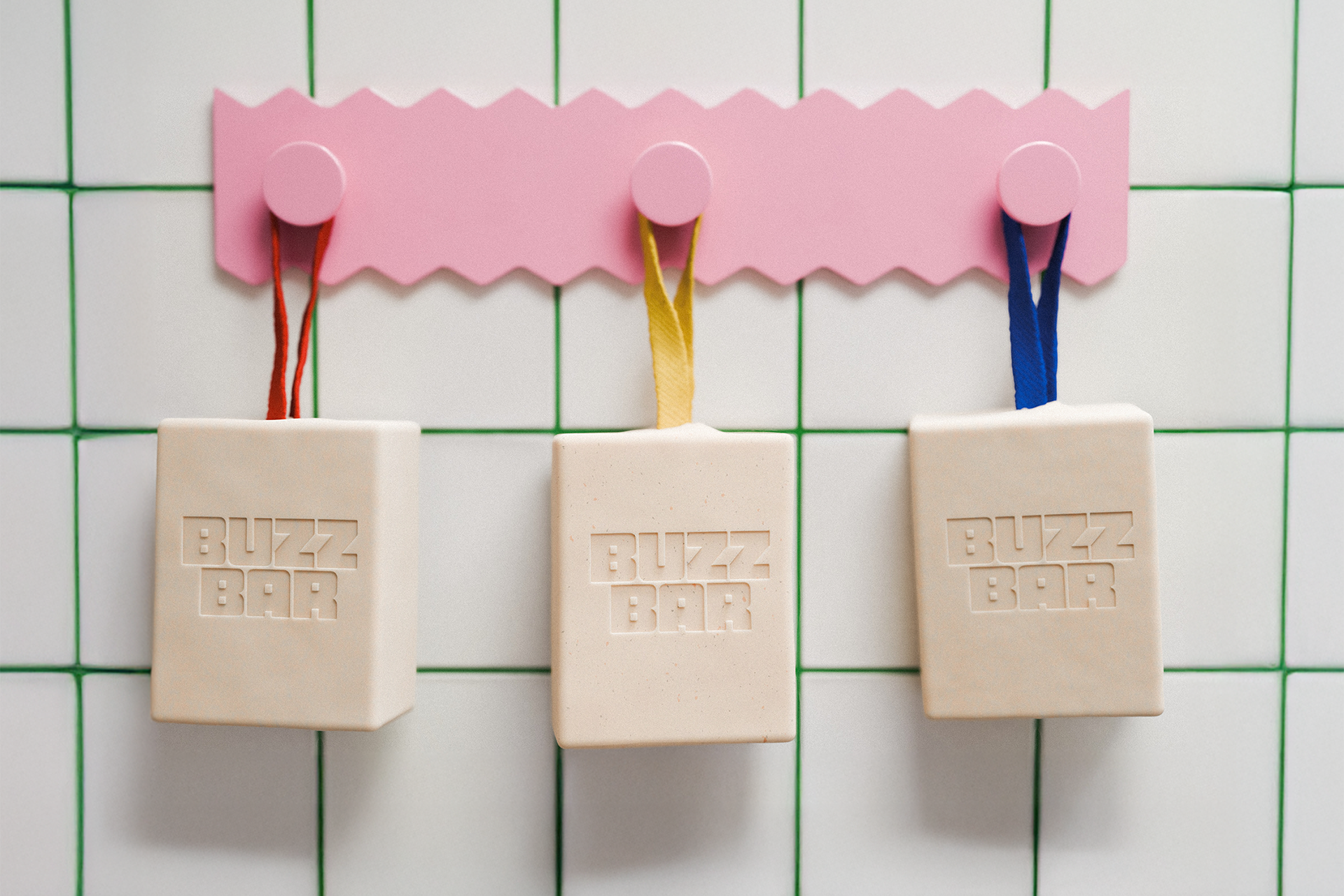
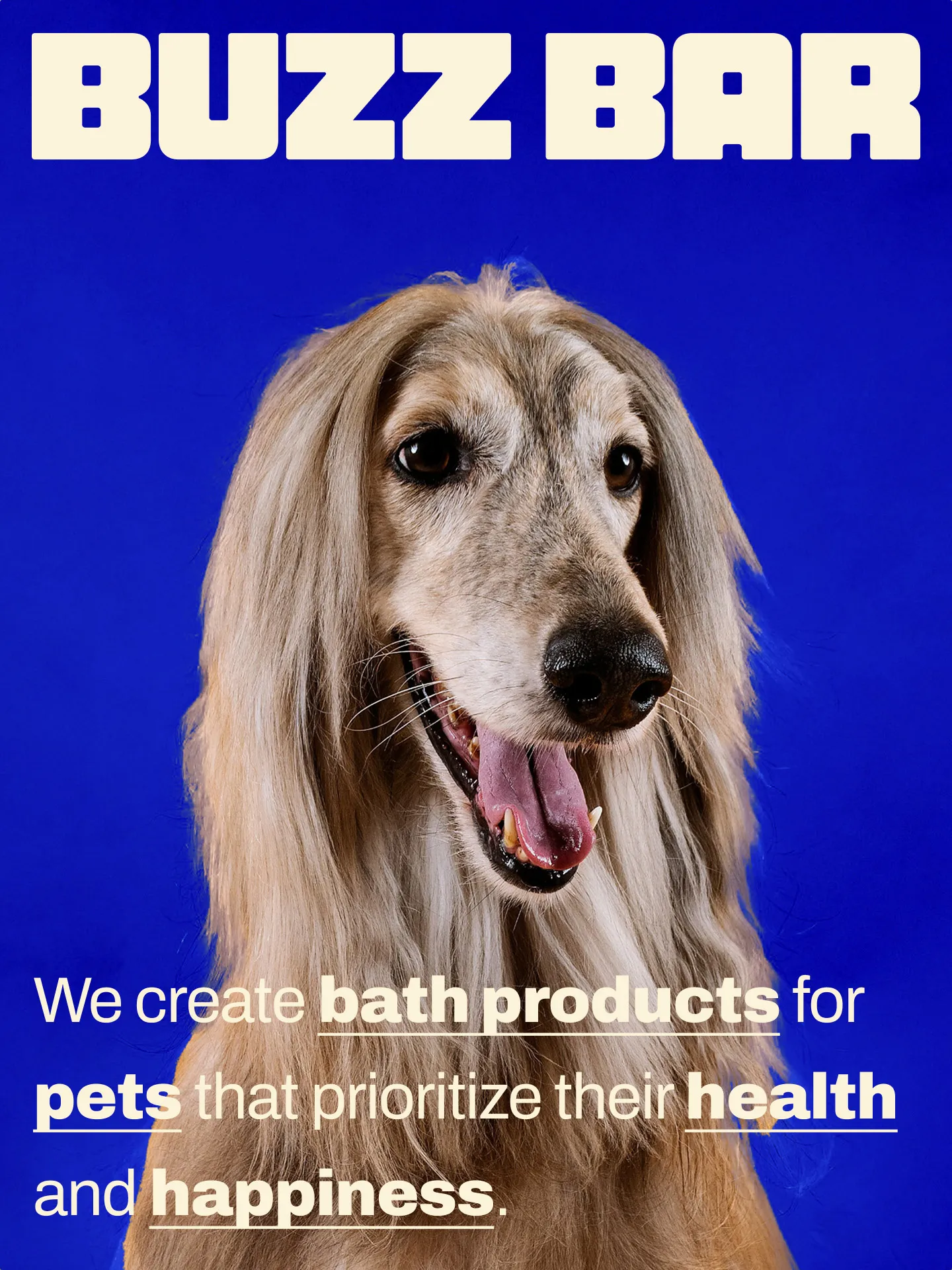
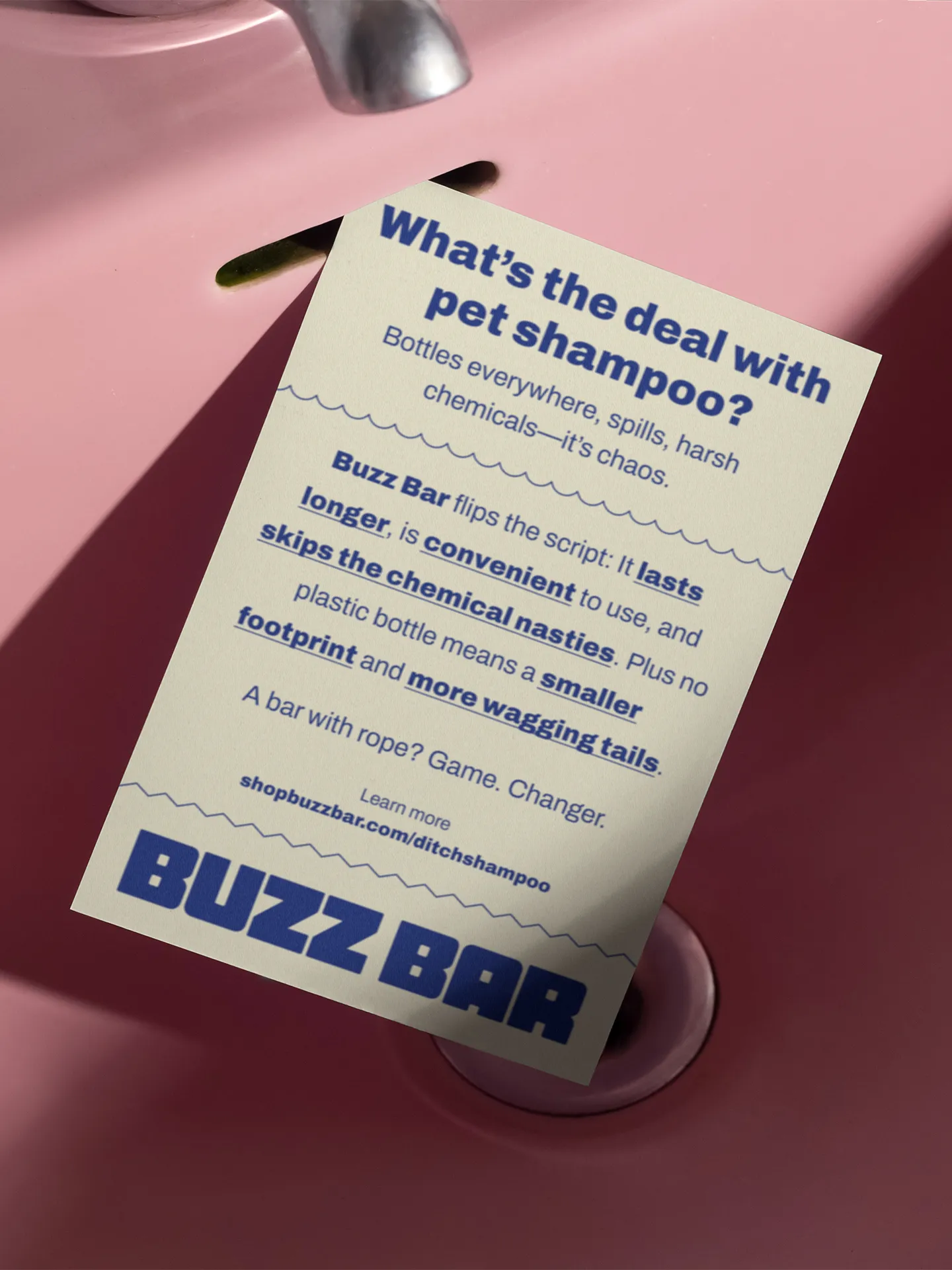
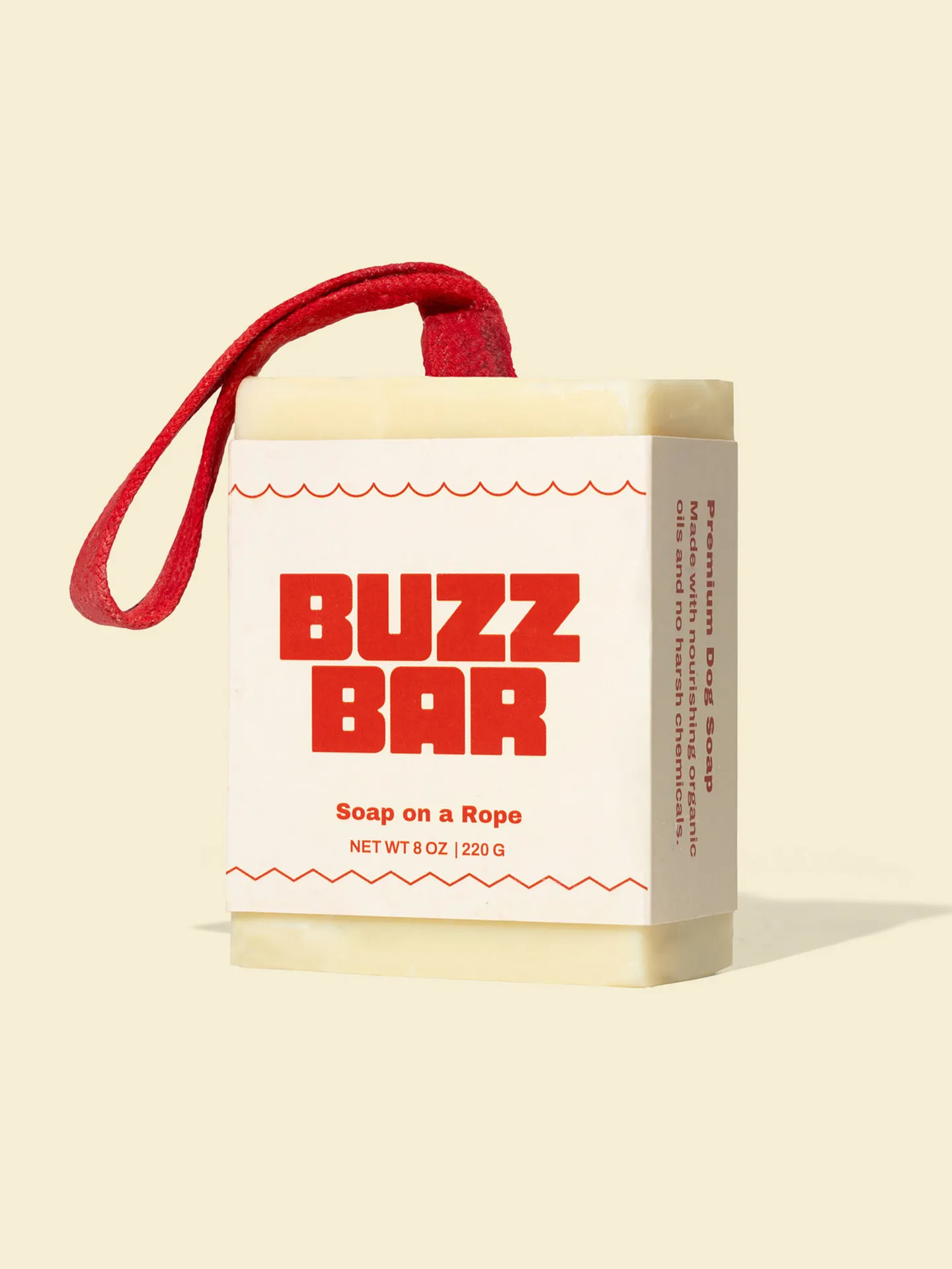
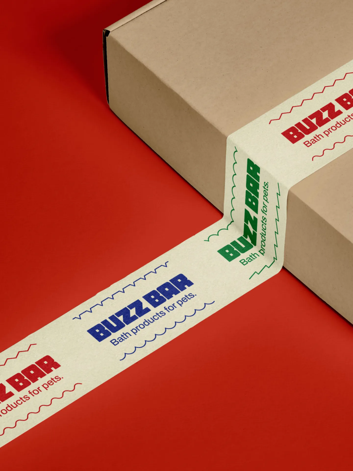
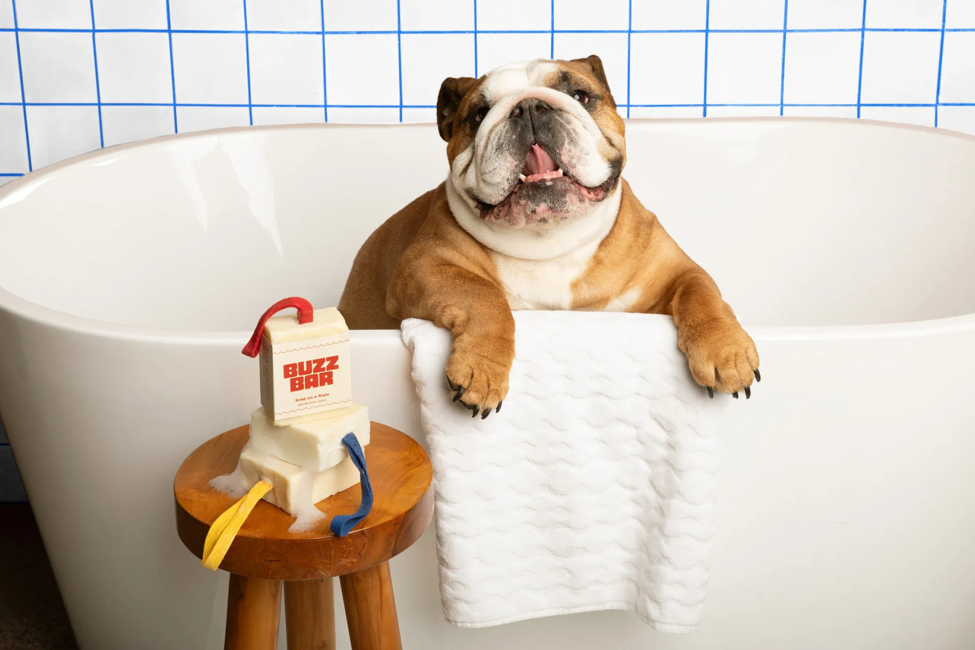
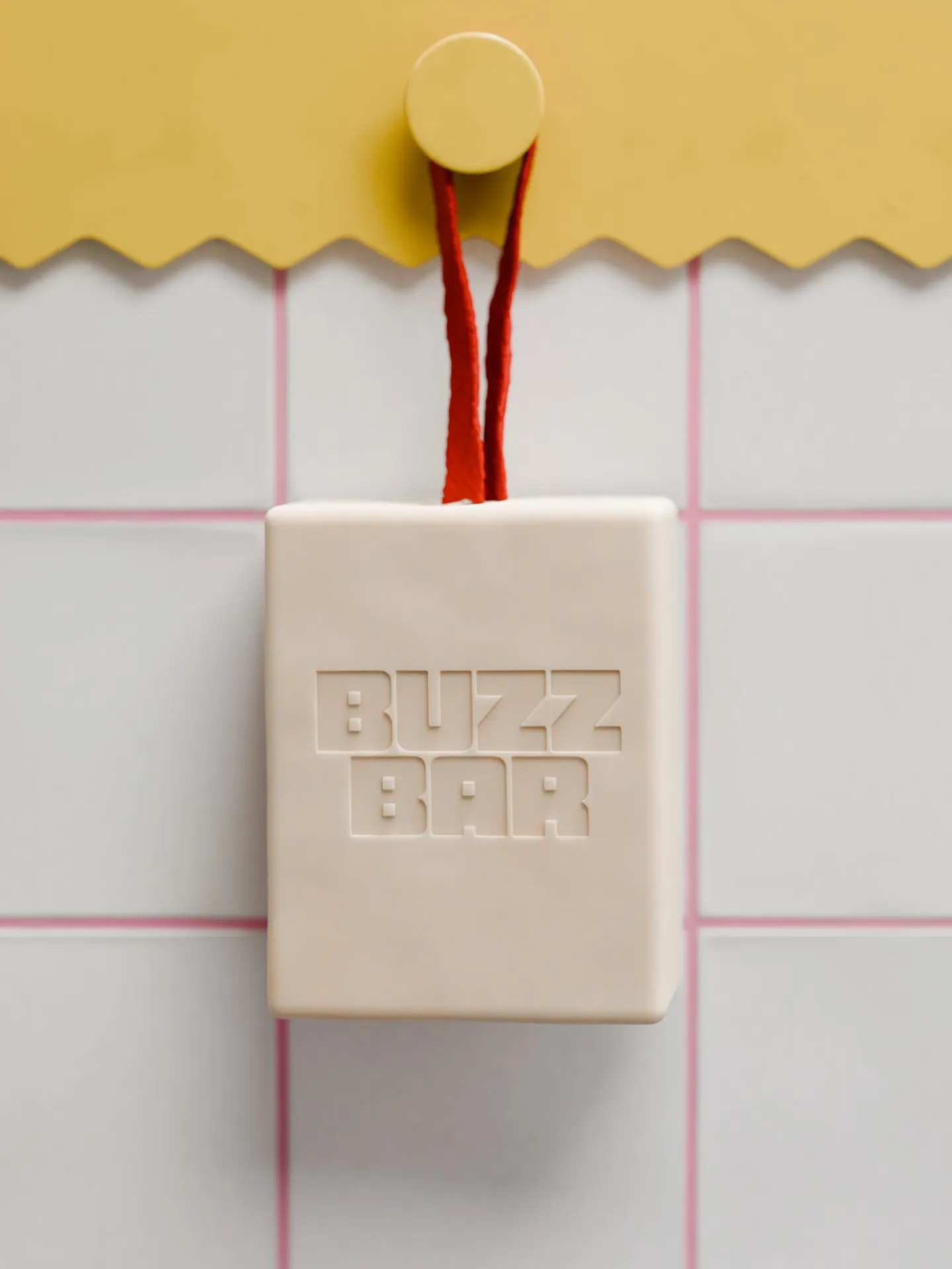
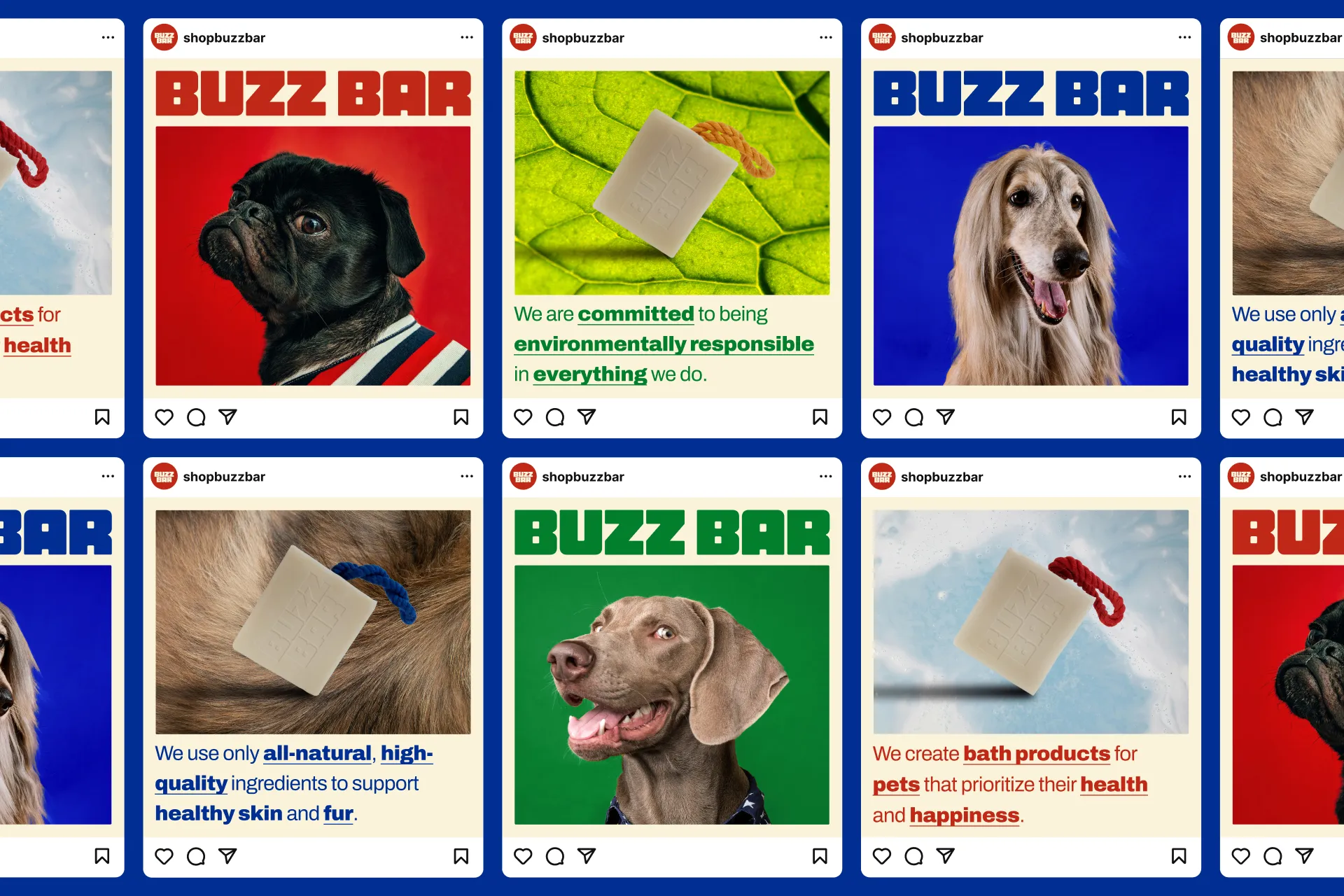
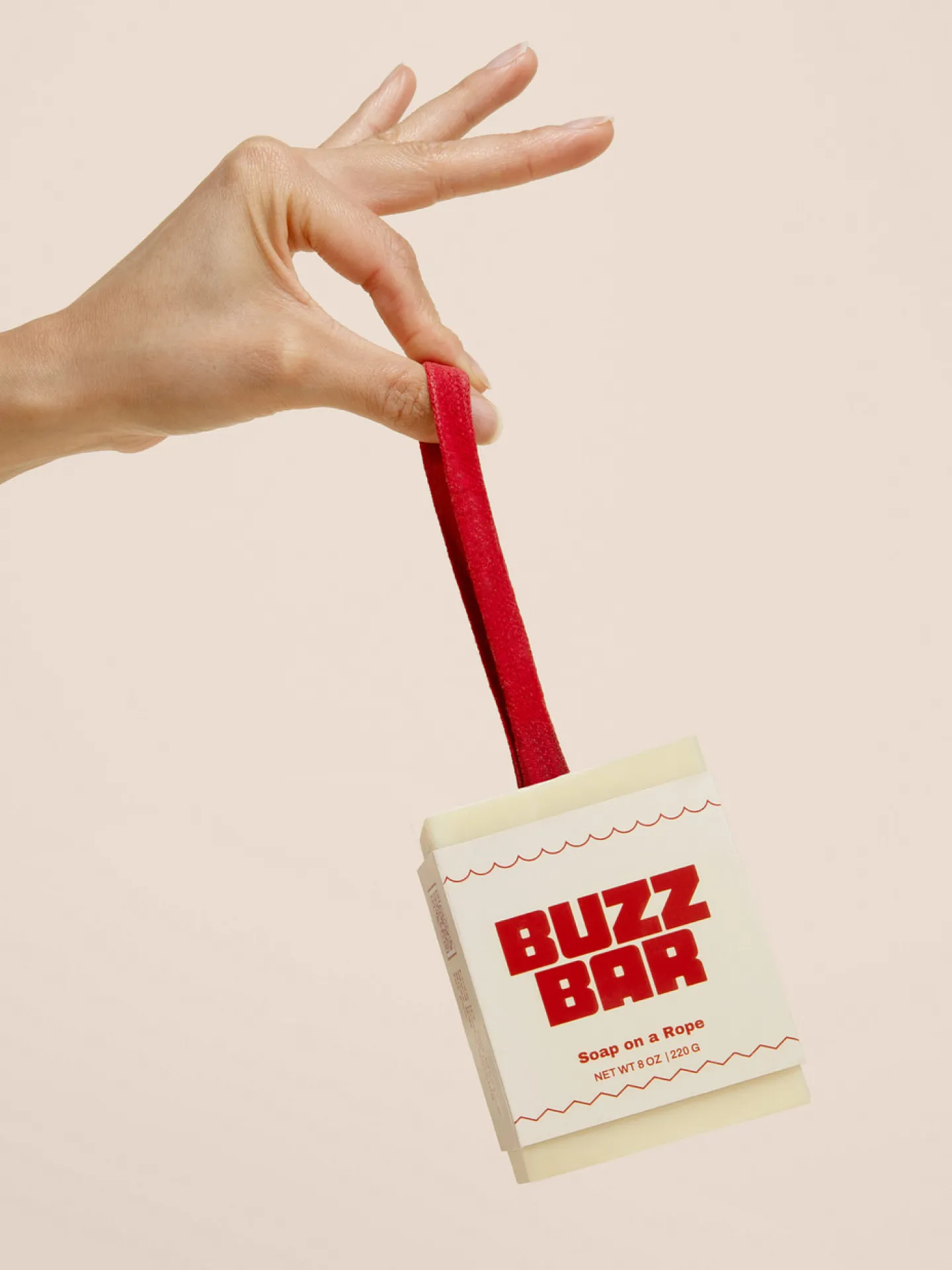
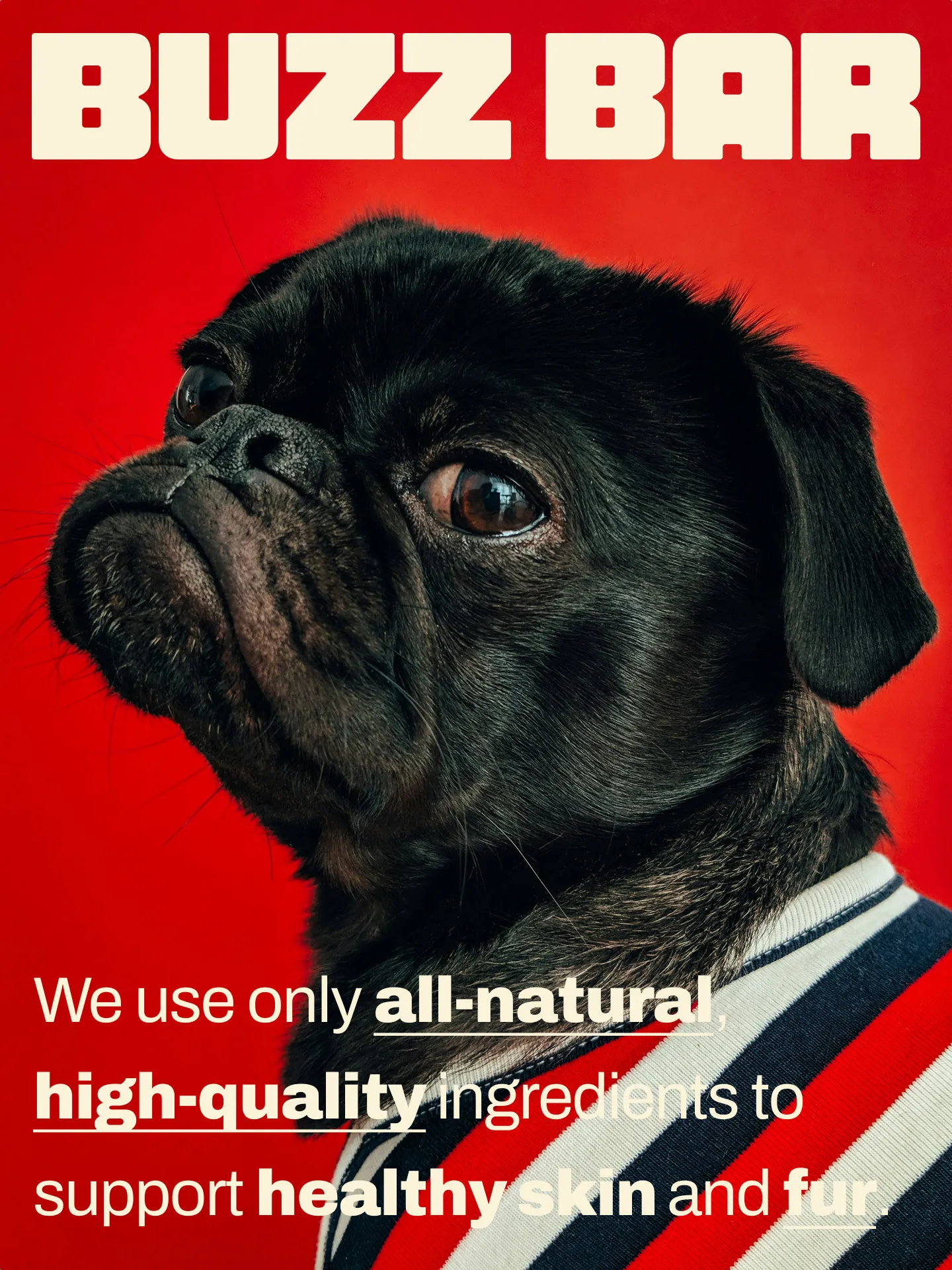
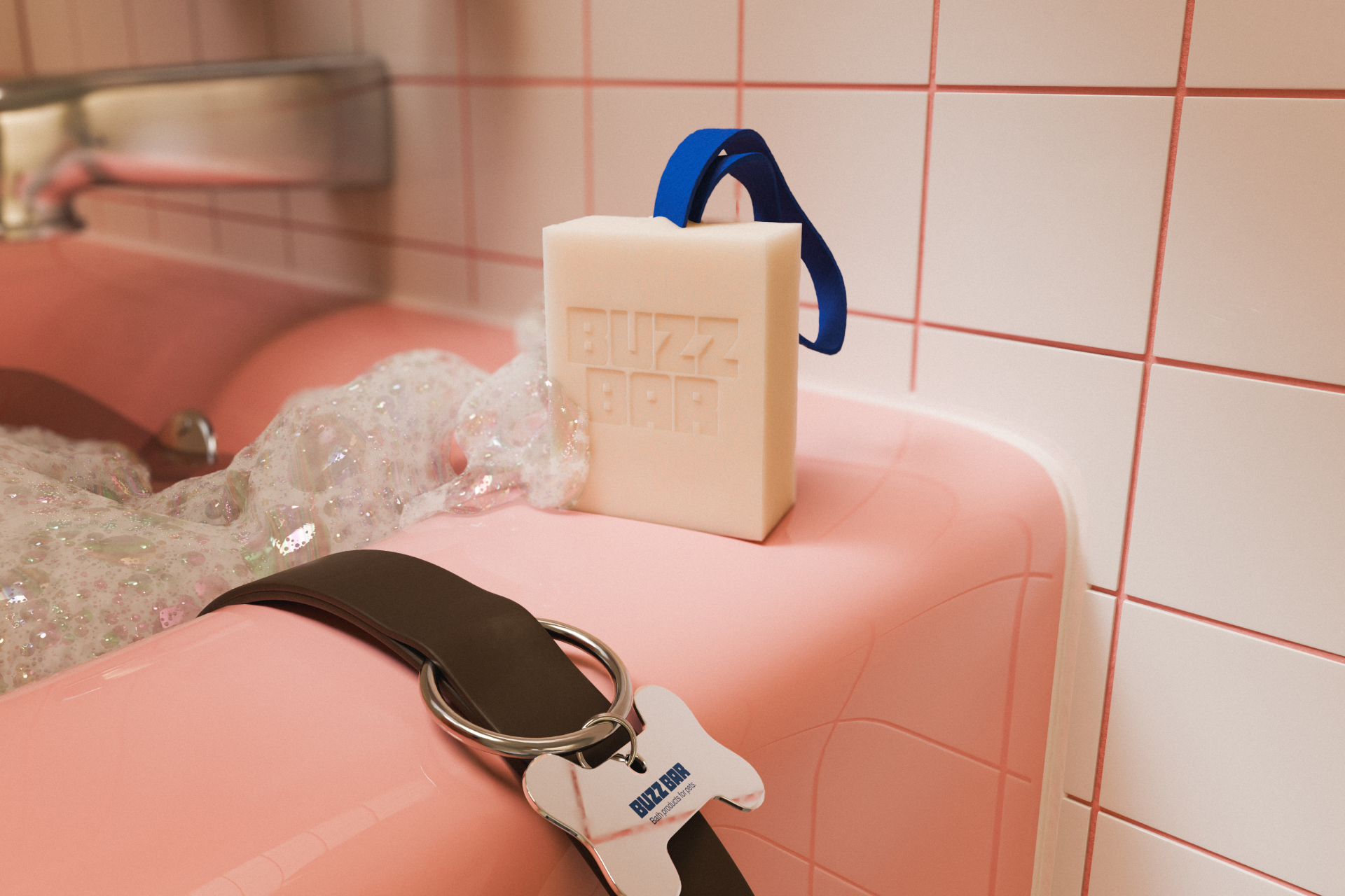
Toil partnered with Buzz Bar to create a fun and friendly brand identity in preparation for their launch. Buzz Bar makes bath products for pets, and they wanted a look that felt bold and full of personality to attract young pet owners. Those who want an alternative to shampoo that's both safe to use and good for the environment.
The founder of Buzz Bar, Jane, came our way from a referral. Which is how most of our working relationships start. Jane came in asking all the right questions. Like, should I expect? How would you approach this project? And what's your dog's name? Her name is Penny, who sleeps by my desk every day. I love her dearly, but she can be a stinky pup. At best, she smells like how a dog should, and at worst, she can smell like garbage.
With Jane, the pressure of being a founder was clear. Starting a new business comes with a lot of risks, like choosing the wrong creative partner. Jane expressed that she's looking to work with someone who has a point of view on how to approach problems. Building a brand comes with its own set of complex challenges, and helping a client navigate through the process is something I get a lot of joy from. Being very transparent about my creative process helped build that trust.
Especially in an era of AI and shady outsourcing, showing the work and the creative thinking made the whole process that much more successful. That's why I enjoy working directly with founders. They are, most of the time, directly responsible for the success and failure of the business. And in this case, Jane wanted to make something special together. She just wanted to choose the right team to take on the job.
Jane's goal was to make bath time with your pet easier. Most people use regular shampoo, but having to stop to reach for the bottle mid-bath is annoying. Her idea was to make a bar of soap molded around a colorful loop of rope. She shared early versions of the product, which I used on my dog, Penny, which was a great experience. I could easily lather up Penny with one hand and scrub her down with the other. Fingers crossed Jane comes out with a "Buzz Bar Dog Robe" because drying a wet dog is another challenge in itself that usually ends in zoomies.
She shared photos of her creating the batches of soap and cutting them down to size. A fun process to watch as she made improvements to the product in both the soap recipe and the size of the rope. Changes based on feedback from family and friends.
We knew from the beginning, we wanted the logo to be bold. Like, in your face—bold. Like, stamp it into soap—bold. The inspiration came easily as the logo was designed to resemble the shape of the soap. Each letter was custom-made to be blocky with rounded corners. I like to think that if we wanted to, each letter in "Buzz Bar" could be a soap bar. And if you were a true Buzz Bar fan, maybe you'd collect them all. Perhaps this was wishful thinking.
To balance out the bold logo, we picked a simple font called Archivo. A grotesque sans serif typeface family that's easy to read. It was a perfect match that fit the vibe of the brand. A big bonus is that it's a Google font, which means it's free to use for commercial use. Nice on the eyes and easy on the wallet.
To represent the main benefits of the brand, we created unique illustration icons. This extension of the brand opened the door to introducing more robust illustrations in the future.
When we looked at other pet bath brands that made soap bars, most of them felt plain and forgettable. This opened the opportunity to build a brand that felt bold and playful. Early on, Jane shared a moodboard filled with bright, colorful images. She liked the simplicity of using primary colors. It reminded us of how people treat their dogs like kids, and how kids' toys are often only primary colors like red, blue, and green.
This foundational thinking made creating the color palette straightforward. We expanded the colors to include complementary colors like yellow, pink, and brown. The color combo we loved the most is using the primary colors against the color cream. This gave a funky energy that Jane was really into.
We used squiggly lines throughout the brand to add a sense of fun and movement. They feel playful and a little messy, like something a kid might draw. It’s a small way to show how we treat our dogs like our kids. You'll see these lines used in layouts and on packaging. One of my favorite applications is how it looks on the business card. A different playful line between each line of info. I know people don't hand out cards as much anymore, but this one feels special. You could at least use it for a bookmark!
The world we wanted to create for Buzz Bar is bright, clean, and full of charm. For the art direction, we imagined dogs getting portraits taken in front of solid, colorful backdrops. As if they were getting glamor shots after a fresh bath. When showing the product in a bathroom, we loved the idea of bright tile and funky shower hooks. We wanted to make sure the product complements the space it exists in.
Testimonial
Working with Alejandro has been such a rewarding experience. He's a genuinely thoughtful person who immediately invested himself in the success of my brand, and that level of care is in every detail of his work. Everything he does feels purposeful and intentional, reflecting not just his talent but also his deep care and understanding of my business.
Today, I have a brand that not only looks incredibly professional but also feels authentic to who I am and what Buzz Bar stands for. I feel so confident and proud to share the Buzz Bar brand with the world and I'm deeply grateful to Alejandro for bringing it all to life with his thoughtful, intentional approach.
— Jane, Buzz Bar