Introduction
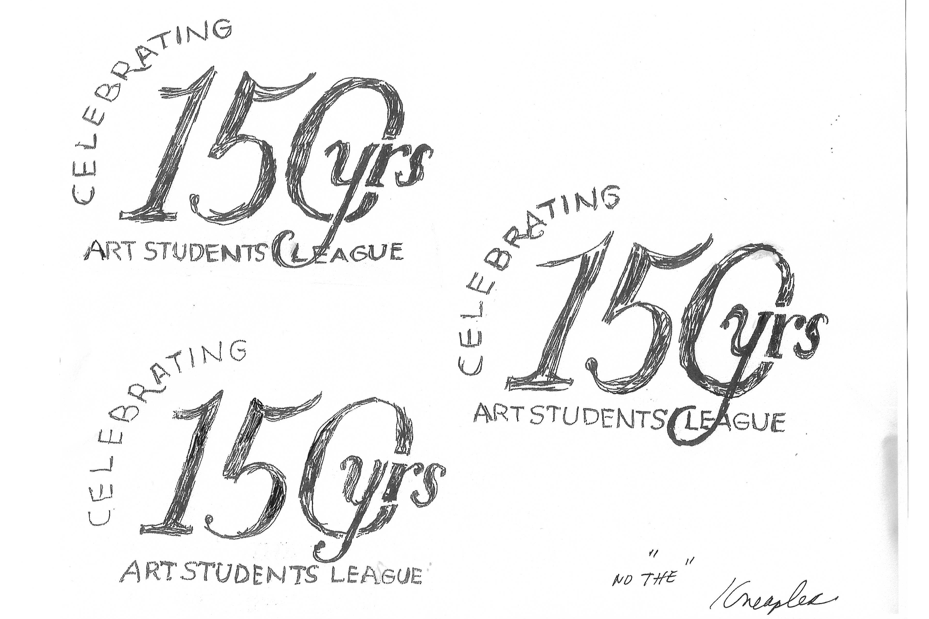
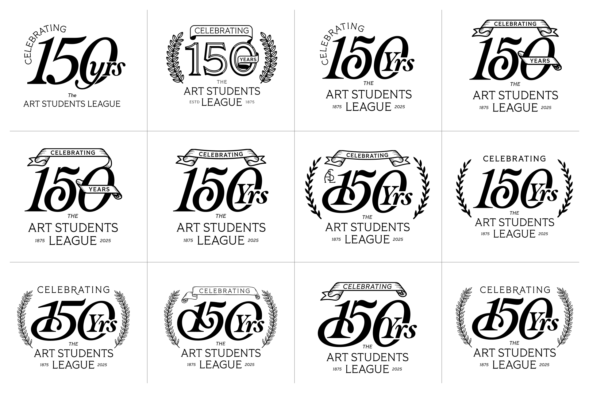
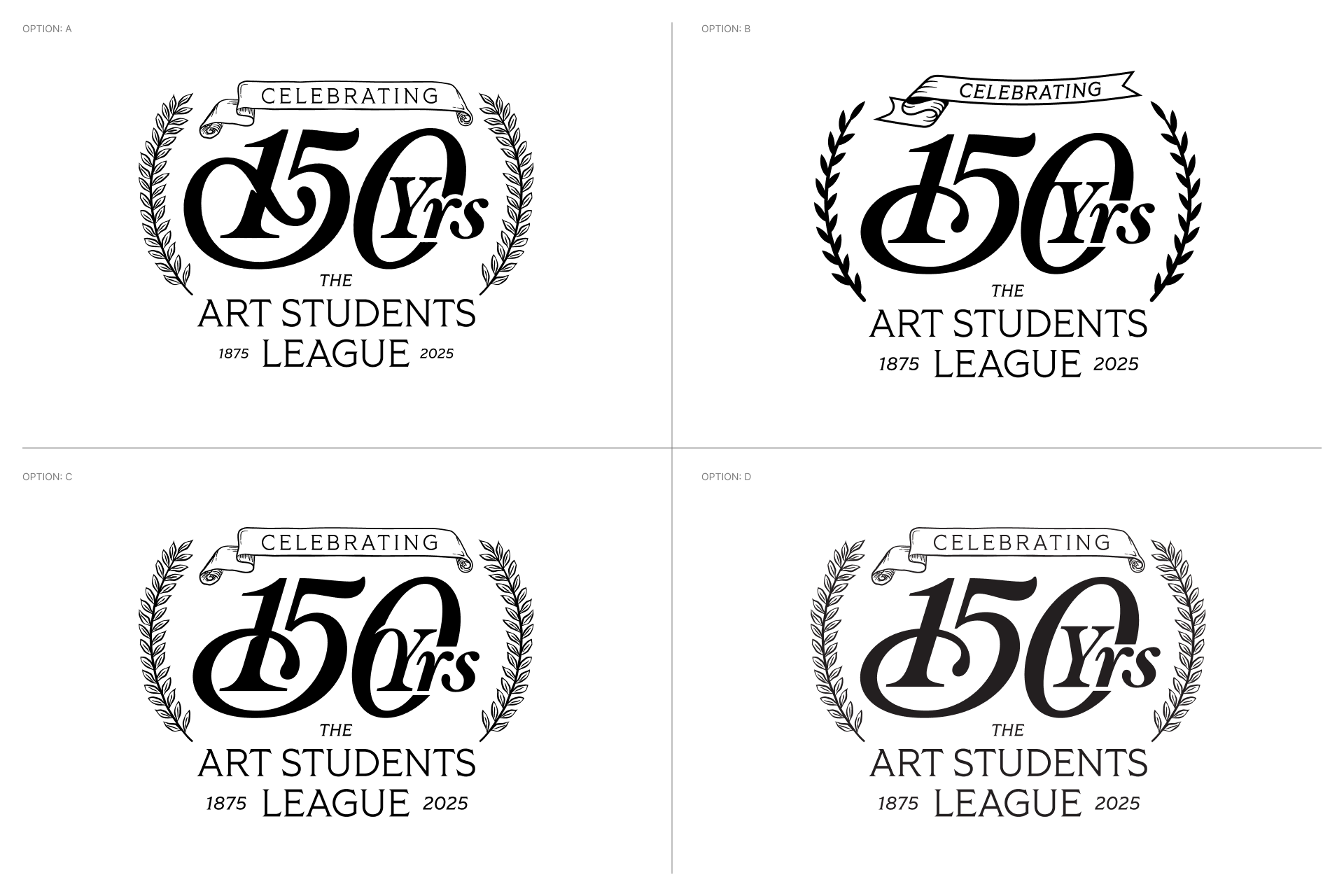
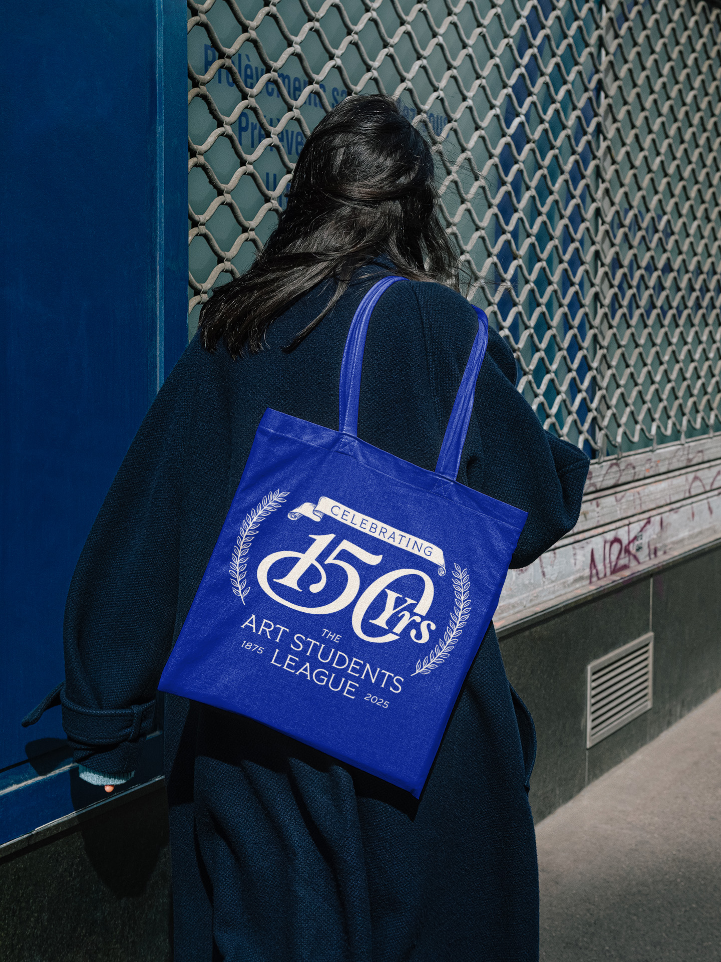
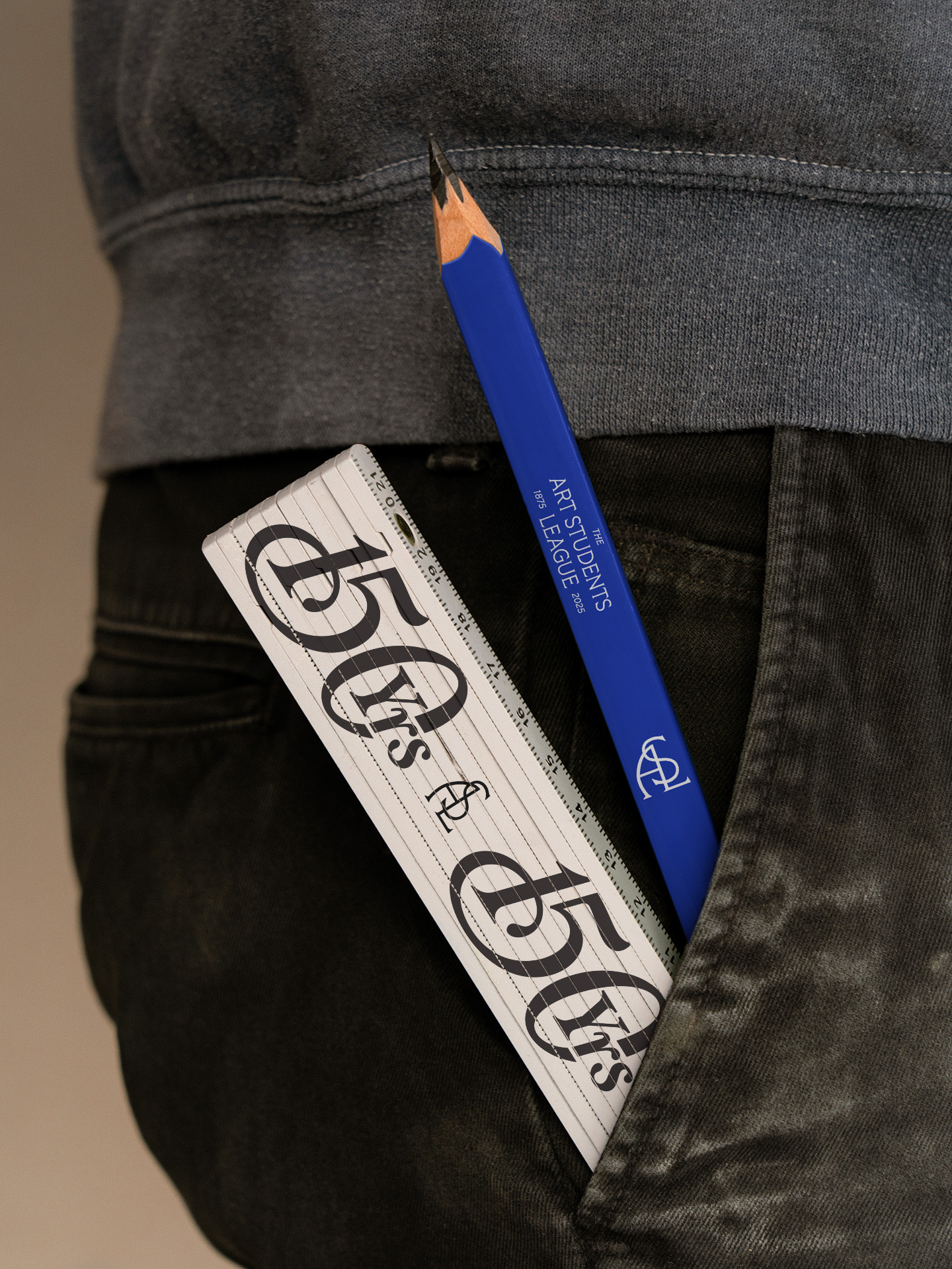
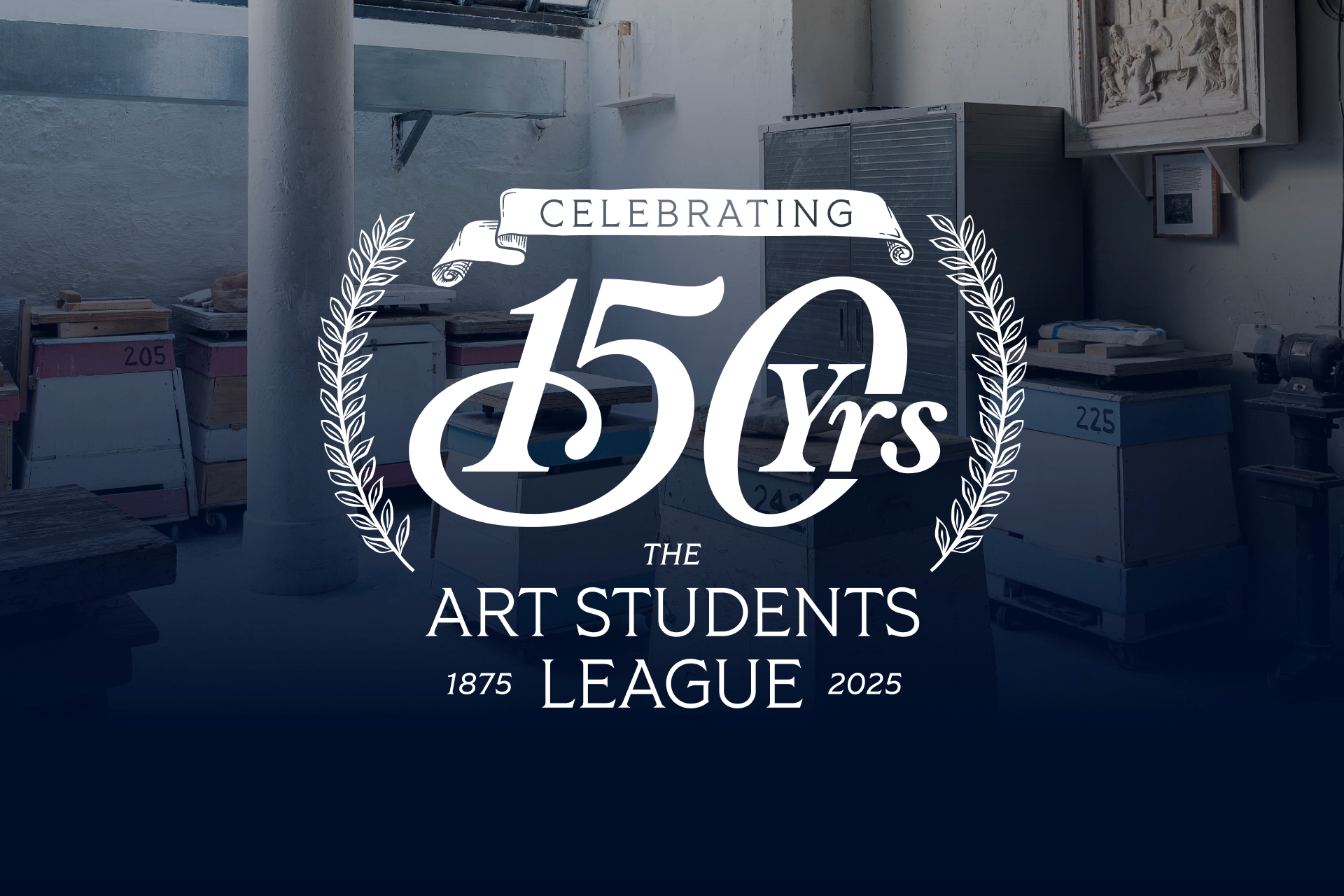
Celebrating 150 years of artmaking at the Art Students League.
Client: The Art Students League
Date: March 27, 2025
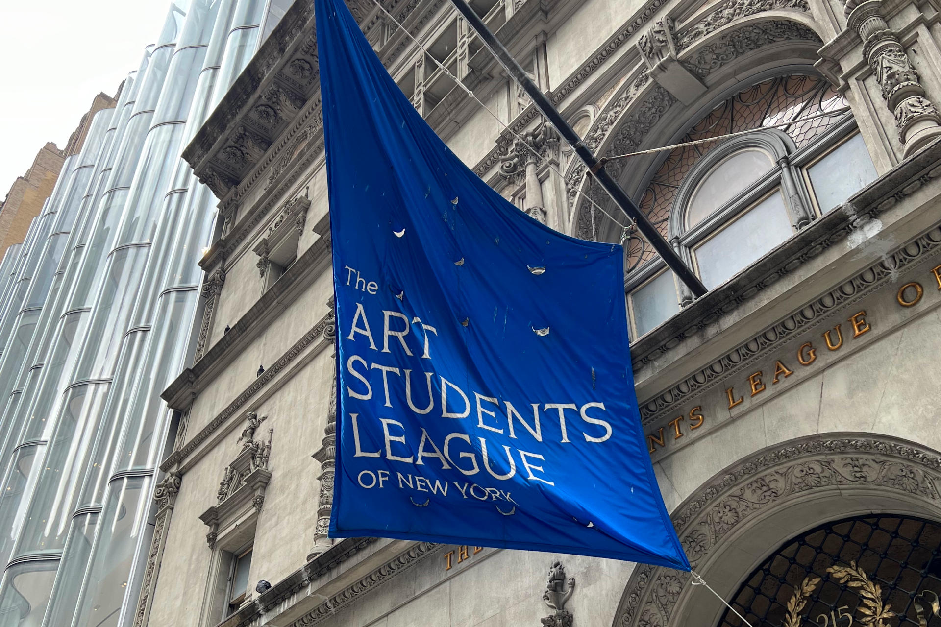
The Art Students League
Overview
Hand-lettering, logo design, illustration
We partnered with the Art Students League (ASL) to create the visual identity for their 150th anniversary. The League is one of America’s oldest art schools and has welcomed students since 1875. The goal was to reflect its long history and studio‑based approach to art education. The final identity carries a sense of tradition and creativity in a fresh, modern style.