Introduction

The savory journey to the Season 27 Hot Ones lineup.

Client: Hook & Arrow

Author: Alejandro Rodriguez

Date: May 25, 2025

Hook & Arrow

Overview

Brand Strategy, Brand Design, Label Design, Art Direction

Hook & Arrow is a condiment company producing hot sauces made of all-natural ingredients for those seeking adventure and outdoor prosperity. We worked together to communicate the brand's mission and to create a visual identity that allows the flavors and colors of the sauces to be the prime focus.

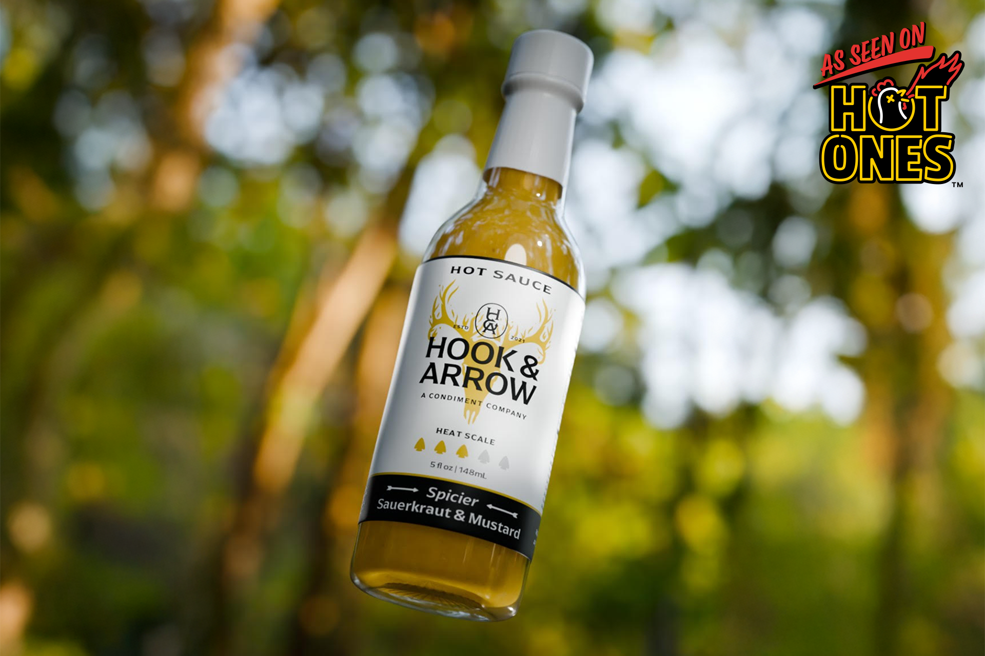
Congrats to the team Hook & Arrow for joining the Season 27 Hot Ones lineup with their new sauce Spicier Sauerkraut & Mustard!

Available now at Heatonist.com 🌶️
About the Partnership

Toil and H&A joined forces in 2021 to accomplish a simple goal: Create a hot sauce brand that resonates with the everyday adventurer. The key ingredient to our success wasn’t salt but clear communication and collaboration.

From the beginning, we had open conversations about what problems we wanted to solve and where we wanted to take the brand. Our process was a six-week journey of discovery, strategy, and design. The first objective was to answer a basic question: What does Hook and Arrow stand for, and why should anyone care?

In a world where many brands are fighting for your attention, it's best to put effort into communicating what makes your brand special and let those who care come to you. When you can easily communicate your why, it empowers customers to identify with your purpose.

Toil did this by having founders Henry and Sam participate in a brand strategy workshop. We dug deep into who their ideal customer is, what value they bring, and why this all matters to them. Giving them a clear understanding of who they are beyond what's inside the bottle.

A cayenne garlic Hook & Arrow condiment product placed alongside a plate of food.

Call Us Old Fashion

What’s the criteria that makes a cool hot sauce label? Bright colors? Visuals of fire, zombies, and bombs? Apparently, this is what everyone thinks. When gathering visual inspiration, we took the road less traveled, which was looking at vintage whisky bottles.

In this era, large bright colors were less common. More emphasis on thoughtful type hierarchy on white/off white labels. We loved this approach since it felt more in line with how we wanted the brand to be perceived—timeless and of high quality.

A photograph of a Hook & Arrow hot sauce condiment product shot next to a delicious place of fish. Other interesting elements surround the plate.

The H&A Monogram

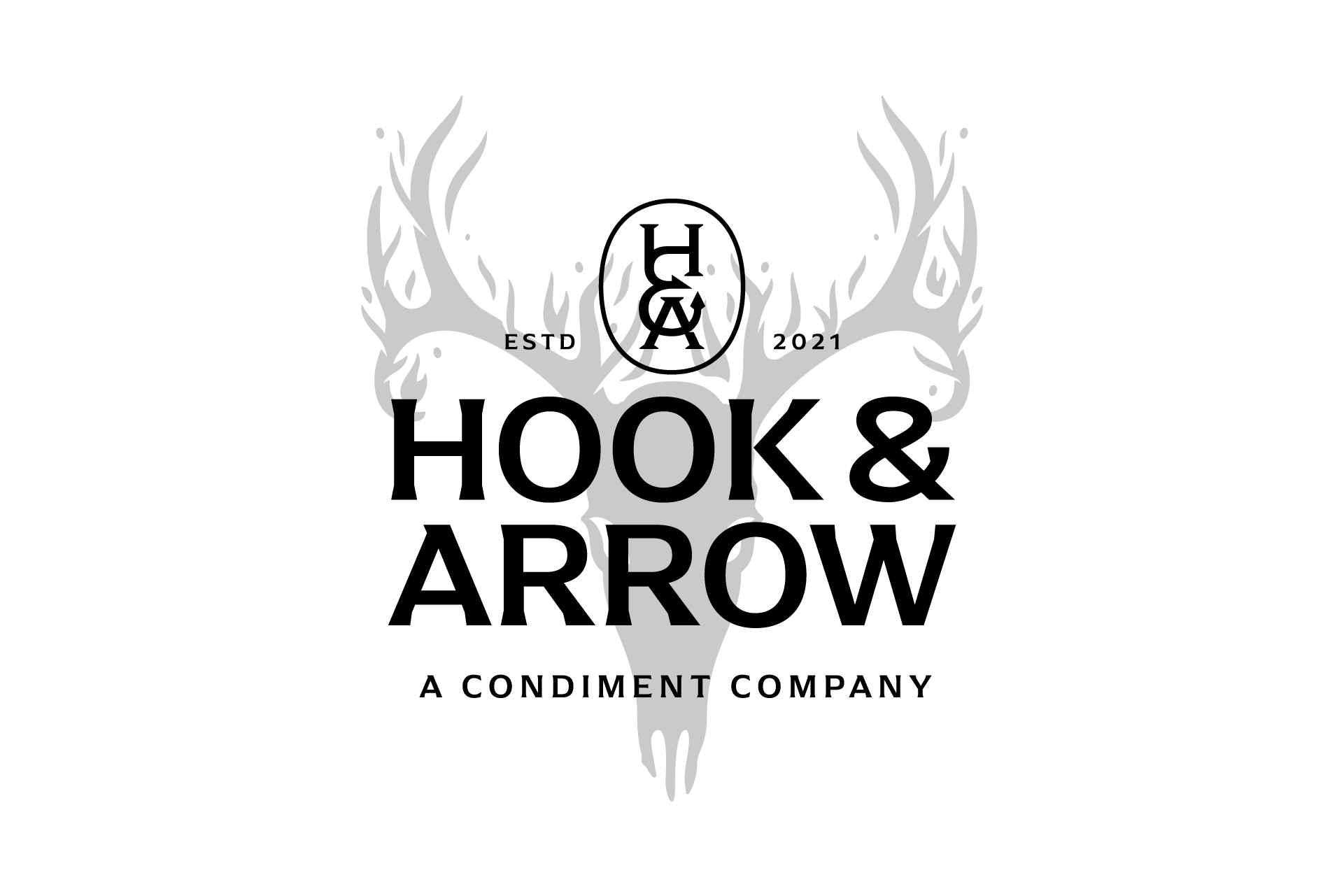
When starting explorations for the visual identity, we discussed creating a recognizable monogram that combines letters, an arrowhead, and a fishing hook. This was a tall ask. And honestly, I wasn’t sure we could pull it off. Early project files contain early concepts that explored many different ideas. Some good. Mostly bad.

Until I noticed that while stacked, the top of the ampersand could replace the crossbar in the “H” and the bottom of the ampersand could replace the crossbar in the “A”. The final touches of adding the arrow and hook created a final product that nailed the brief. This is by far one of my favorite monograms made to date.

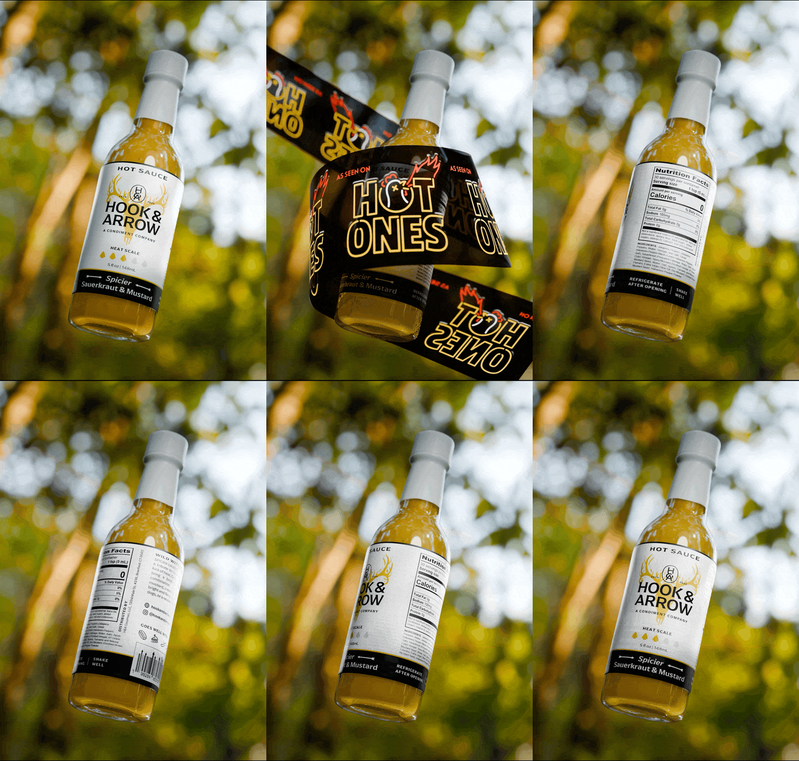
A black on white graphic breaking down the Hook & Arrow logomark. Lines show various features like a diagram.An animated gif showcasing the Hook & Arrow condiment designs being show in sequence. The bottle are placed on scenic background images.

The Fire Deer Skull

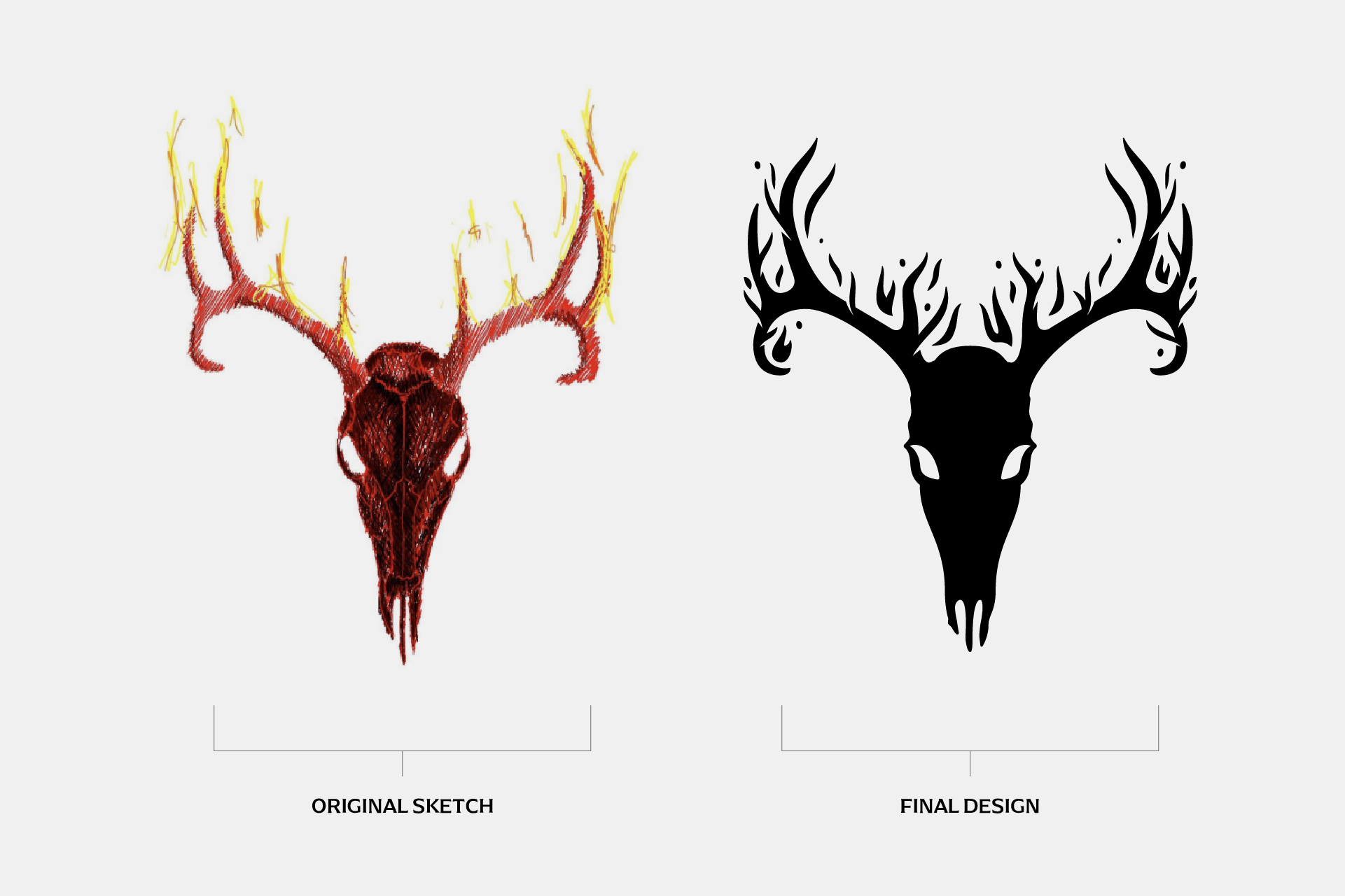
Another element that Henry wanted to see prominent in the visual identity was the silhouette of a deer skull engulfed in flames. He shared a still life of deer skulls and flowers from his senior project in college. A very cool visual reference.

Keep in mind, I’m not quick to accept client inspiration or references as subjective elements could steer the project away from the original strategy. But this reference fit perfectly in. I created a vector version of the deer skull that, while locked up with the H&A logo, is layered behind the elements to create a nice depth of detail.

A graphic of a cow skull on black and white. The horns appear to be on fire.

Cabin in the Woods

Toil art directed a shoot called “Cabin in the Woods,” a concept built around the feeling of a weekend escape and the quiet moments after a big breakfast or dinner. The idea was to create images that feel lived-in, using vintage cabin props and Hook & Arrow hot sauces to tell the story. At the heart of it is a father-son trip, where the dad cooks favorite meals and shares old stories, passing down memories just like his own father once did.

It was a true team effort. Henry and Sam handled the cooking, and Henry also photographed the scenes.

A image of two Hook & Arrow condiment products placed alongside a several plates of food.

Testimonial

Hook & Arrow would not be what it is without the help of Alejandro of Toil Studio. We had a few good recipes, but we know we needed more to build the foundation for the company. We started working with Alejandro thinking that he would create some logos and labels, but he did so much more. he helped us define what Hook & Arrow is.

— Henry and Sam Dziekan, Hook & Arrow

← Previous ProjectNext Project →